
Document-free ID check
Identity verification designed for the digital age.
Read time: 12 minutes
As the second designer hired at OneID, I helped evolve an identity and age verification tool, originally used by a few e-commerce clients, into a full customer verification solution used by companies like DocuSign, Adobe and NatWest. Being a small start-up, I worked directly with the leadership team helping develop product strategy and internal processes.
Team size
Product team size 6; Sole designer
Role
Sole UX Designer, leading end-to-end design process
Skills & Tools
Led user research (quantitative and qualitative) using Lyssna.
Analysed qualitative insights from external lab user testing, ran design workshops and managed cross-functional stakeholders.
Created a series of user flows, wireframes and high-fidelity prototypes in Figma.
Impact
Increased overall user conversion across identity, age, and onboarding flows from 31% to 67%, reaching 78% for identity verification.
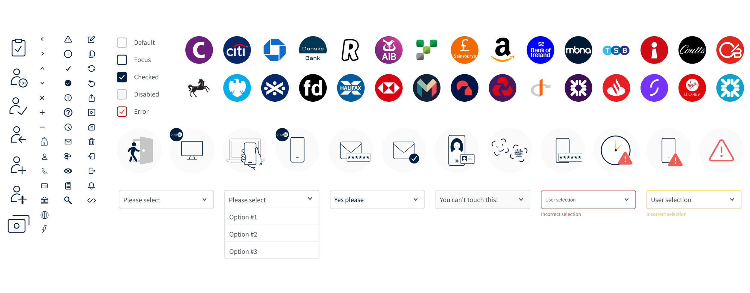
Built and maintained a scalable design system in Figma using components and variants.
Reimagined the product brand and voice, elevating consistency and user trust.
Context
Company Stage
As many new start-ups, OneID (formerly Digital Identity Net) was refining its product direction, without target markets and a clear, defined brand.
Product Offering
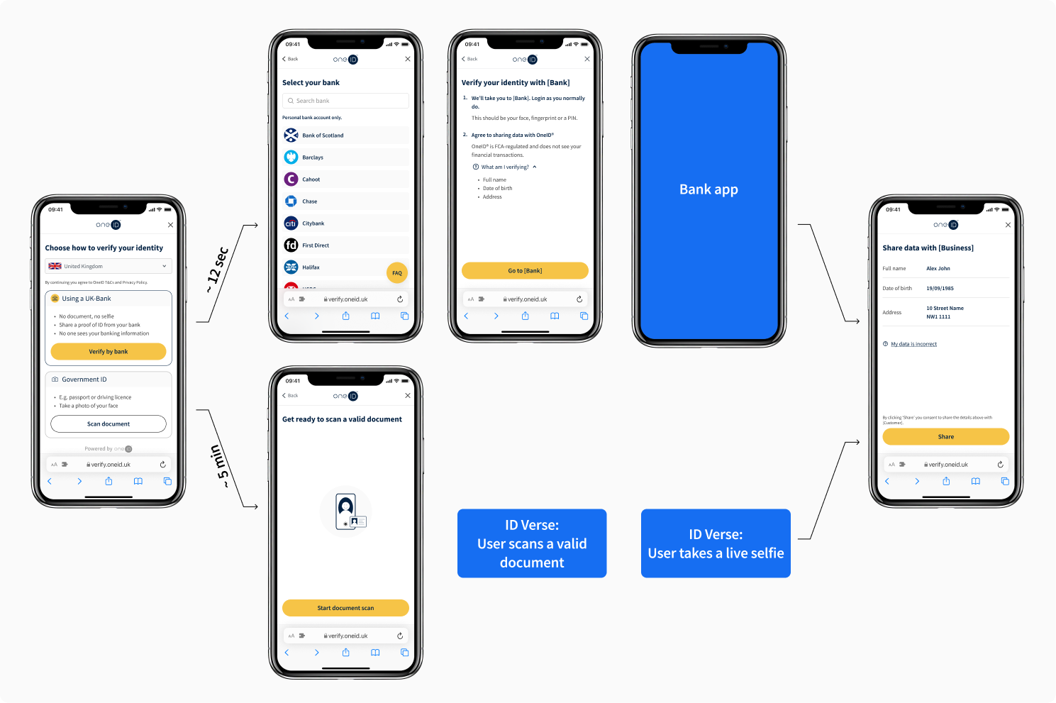
Introduced the first BankID in the UK, an identity solution that lets users verify their details (name, age, address,…) without documents. OneID helps users connect to their bank so that they can share minimal required information, enhancing security and privacy.
Market Position
Identity and age verification are becoming more common, but the process is still pretty clunky. Most users are asked to dig out documents, take selfies in the right lighting, and end up sharing way more personal information than they need to.OneID aimed to establish a foothold in a market dominated by established identity providers by improving the user experience and product-market fit.
The problem
Users were not adopting OneID’s bank verification as expected. Using banks is a great solution in theory, but still unfamiliar to most people in the UK. Many banks haven’t fully embraced data sharing yet, and some display alerts or error messages that feel confusing or even alarming. The product also was only 1 year old and still very immature. On top of all that, there are edge cases, like joint accounts and international users, where things don’t always worked out as expected.
The ultimate goal: To reduce abandonment.
Challenges
Friction in the user flow
The flow was functional but unintuitive. Users faced confusing steps, a lack of proper error handling, and no tailoring for different user demographics, leading to drop-offs and frustration.
Disconnected from client’s journeys
The identity check felt like a bolt-on rather than a seamless part of our clients’ platforms, which undermined user trust and hurt conversion.
External inconsistency
Many UK banks displayed alerts or messaging that conflicted with OneID’s approach to data minimisation, adding confusion and eroding user confidence.
Unfamiliar mental model
Using a bank as an identity provider was a new concept for most UK users. We had to build clarity and trust into every step without overwhelming people or relying on assumptions about technical literacy.
Solution
Beyond UX & UI, I stepped back to re-think our product strategy:
Product-fit evaluation
By focusing on product fits where both users and customers could get the most value out of OneID. A big mindset shift was recognising that identity verification isn’t the user’s end goal - it’s just one step in a much broader journey.
Borrow credibility
No user ever woke up aiming to verify their identity or age - they want to sign a document, complete a pre-employment screening, or buy a case of wine online - users motivation lies with OneID’s clients. With that in mind, we removed formal onboarding and redesigned the flow to feel lighter and more contextual, using progressive disclosure to surface information only when it was needed. This helped reduce cognitive load and made the experience feel more natural, especially for first-time users.
Refine UX/UI for each step of the journey
We broke the flow down step by step to improve every moment of the experience, from first entry point to final confirmation, and aligned each stage with clear KPIs.
Understand demographics and real coverage
We knew that almost every adult in the UK has a bank account, but OneID was not factoring how many had supported bank account types, or how many internationals were trying to use our service. We built events and created a PostHog account to track user behaviour. We also created an exit-flow to gather real user feedback, which helped us understand pain points and edge cases. Based on those insights, we:
Expended coverage by partnering with international eID schemes;
Introduced document scanning only when necessary, keeping the flow as low-friction as possible.
These updates made the journey more adaptable and connected, less like a bolt-on to our customers’ flows. Users are now completing it as a natural step, and OneID sees 47% more successful journeys than before.
Empathizing
User testing
As part of a wider company rebrand, we partnered with an external marketing agency who ran moderated usability testing with 18 participants (3 distinct groups). While their focus was on brand perception, we used the opportunity to explore users’ motivations and concerns during the identity check flow.
🔍 Test Setup
Users were asked to sign a fake NDA via e-signature;
Identity verification was required — either through OneID (bank ID) or document scan;
5 out of 18 chose OneID for convenience;
All participants later completed an identity check using a mock bank flow, giving us valuable qualitative feedback and behaviour cues.
💡 What we’ve learned
Trust is tied to context: Users were more willing to engage if OneID was hosted by a brand they already trusted.
Transparency matters: When users were told exactly what data would be shared and why, they were more likely to proceed.
Language influences behavior: Jargon or legalistic language created friction; clear, everyday terms worked better.
Tech-savvy users prefer convenience: Digitally confident participants appreciated avoiding document uploads.
User Personas
-
![anthony-image]()
Anthony
The insecure technical beginner
“An unknown company accessing my bank account without clearly explaining why is, for me, horrifying”
-
![paul-image]()
Paul
The Data Protector
“Because it says the word 'consent’ it makes me feel that if I press it, I've consented to something but I’m not what…”
-
![emily-photo]()
Emily
The pragmatic trader
“You don't want to be wasting time, but you also want to make sure that they're doing it [sharing bank data] properly.”
-
![jamie-image]()
Jamie
The fast-clicking digital native
“If it's an app I trust, I'm happy to have the benefit of, I don't know, ease of access by allowing them to hold the data.”
-
![Sarah-photo]()
Sarah
The fast-clicker non-thinker
“Is there even a next screen, or am I already done with the process?”


Iteration #1
Iteration #1
Findings & Actions
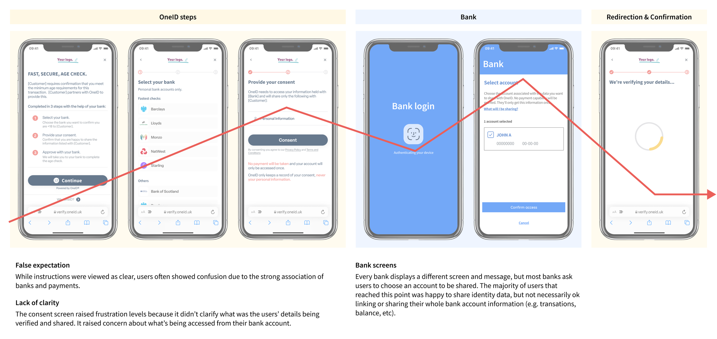
01 Flow
OneID is integrated into its customers’ flows, such as signing an e-document. Initially, the process was intentionally disjointed to onboard users to OneID’s service. However, it became clear that users’ motivation was primarily tied to the customer’s brand, and onboarding-style introduction to OneID’s process left them feeling overwhelmed.
While also enabling white label integrations, we switched from an onboarding approach to a progressive disclosure one, adhering to Miller’s Law and giving the minimum needed amount of information at each step. This helped us address users’ feelings throughout the journey, reducing cognitive load.

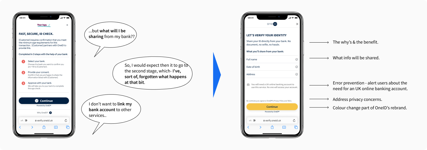
02 Introduction
As part of our new progressive disclosure approach, instead of explaining the process, this step now aimed to get users going. We addressed the key questions raised at this step during the user testing sessions:
Why should I do this? (to verify your identity without having to scan a document);
What are you getting from my bank? (data to be shared, varies by customer).
After this change, the conversion at this step increased 12%.
03 Bank selection
The bank picker was initially split into two sections: ‘Fastest checks’ and ‘Others’, to encourage users to select banks with better data-sharing processes, potentially reducing abandonment. However, this approach discouraged users who found their bank listed under ‘Others’, as they assumed the process would be long. In reality, most users were only willing to share data from one bank anyway.
To improve findability, we made several changes:
Added a search bar at the top of the page for quicker access.
Reformatted the token logos to emphasise their colours.
Arranged the banks in alphabetical order for easier navigation.
To support users who either distrusted open banking or couldn’t find their bank, we also added a floating FAQ button at the bottom of the page.
After this change, conversion at this step increased 4%. Admittedly, this wasn’t the right KPI to measure success. Our aim was to improve findability, so tracking the time it took users to select their bank would’ve been a better indicator — but that data wasn’t available at the time. A good reminder that success metrics need to match testing goals."

04 Bank redirection
The actual consent was now collected at the Introduction step. I considered removing the third step entirely and launching the bank app directly from the bank picker. But due to how the backend was originally built, that would’ve required significantly more development effort than anticipated.
We also hadn’t tested removing the step, and we knew that sharing data through a bank was still unfamiliar for many users. So we saw this screen as useful positive friction - a moment to set clear expectations before handing off to the bank app..
Four months later, 21% more users reached their bank app. Improvements across the flow likely helped, but a smoother hand-off played a big part.

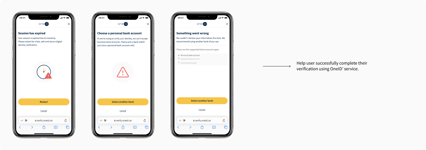
05 Errors handling
I created tailored screens for the most common errors, guiding users back to successfully complete their verification.
I also moved the primary CTAs to the bottom of every screen across the user journey, reducing the distance between decision and action - a small but meaningful tweak, in line with Fitts’s Law.
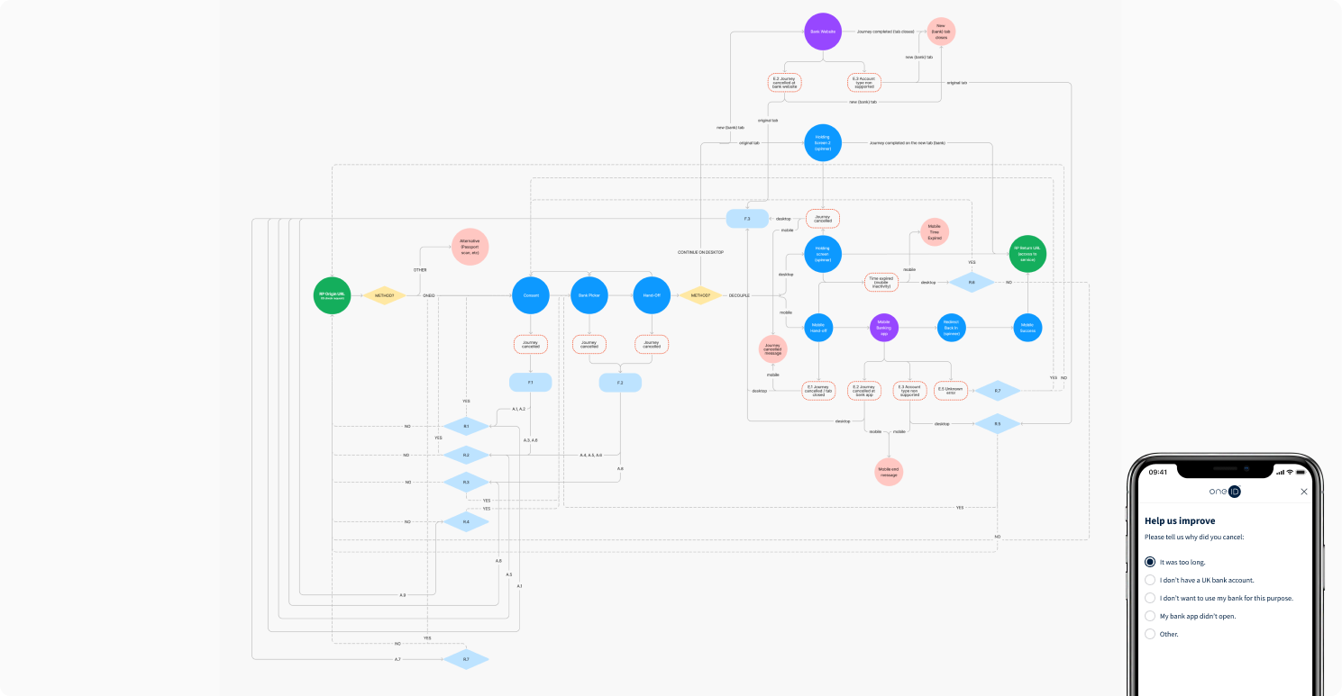
06 Feedback survey
We introduced a feedback survey at the end of both cancelled and successful journeys to gain more insights into our users' feelings and motivations. After each response, we displayed tailored content to address their specific concerns.
Iteration #1
Outcome
🚀 Overall user conversion increased from 31% to 45%.
A new Design System
Iteration #2
Test, learn, iterate… Start over
I continued running online tests in Lyssna (formerly UsabilityHub) and monitored the feedback from the new survey added at the end of the product journey. The insights were invaluable:
We discovered that we had more international users than initially anticipated.
Some customers had recurring users who wished to save and re-use their verified identity.
A few banks returned incorrect name formats or outdated addresses. Users only realised the issue after returning to OneID’s customer, without the chance to correct it.
Prospective customers were increasingly requesting a “one solution fits all” approach, as well as a more flexible fallback flow.
Iteration #2
Findings & Actions
01 Coverage
As a small company with limited resources, the product survey was a free and quick way to learn more about our real users. Unexpectedly, the option ‘I don’t have a UK bank account’ was the second most selected.
We used this as opportunity to expand our service. It wasn’t overnight, but we integrated with 15 European eID schemes and a global a document scan provider. I designed two possible flows:
Default: User choses their preferred verification method, which can be a UK bank, European eID scheme, or document scan.
Fallback: Document scans are more expensive than bank checks, so not all customers wanted to offer their users this option at first. For them, I made a flow where users only sees the document option after they cancelled or failed their bank verification.
To give users multiple options, we needed to adjust the order of actions once again. The list of data had to be removed from the Introduction step, as it depended on the provider selected. Instead, we moved it to the bank redirection step.
02 Data update… the set back 🛠️
Not all customers agreed to add document scan as an alternative due to its higher cost and limited data. We knew OneID needed a simpler pricing model for a multi-provider solution. In the meantime, we planned to help users update their details, starting with addresses. This would also require another ID provider with a good GPG45 score, so the business decided to postpone it until pricing models are reviewed.
While frustrating, it was a delay rather than a cancellation. We're now exploring address updates with credit reference agencies for a future phase.
03 Returning users
We always wanted to create a seamless returning user journey by allowing them to re-use their verified information, but this required major backend changes since OneID didn’t store user data. With growing competition in digital identity, we made it a priority.
This decision reshaped everything we did, sparking discussions around authentication, account recovery, and cloud vs app solutions. We ultimately chose a Cloud Wallet using passkeys and banks as encryption keys. Spoiler alert: we later regretted some of those choices.
Read the OneID Cloud Wallet case study (coming soon).
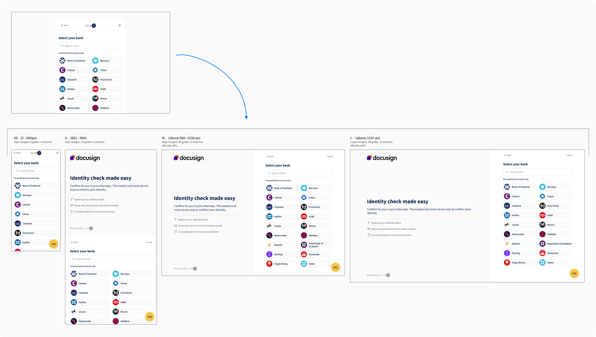
03 Responsiveness
The desktop layout was initially similar to mobile, with the addition of a QR code to redirect users to their banking app. It could be opened in a pop-up or full-screen in a new tab. As more customers requested the new tab format to send users reminder links, we explored new layouts to strengthen the connection between OneID and the customer.
I was concerned that adding more content might increase cognitive load and distract users. To test this, we ran a Lyssna task-prototype test with 25 participants per option, followed by a survey. The two-section layout performed best, leaving a more positive impression on users .
03 Product fit
By gaining more user insight, we re-evaluated our product fit. OneID offers 3 product families:
Identity Check: We had different use cases for this, with most clients being larger companies in the e-signature and HR sector. Conversion was around 80% and users saw a clear benefit in not having to scan documents. Most products verify name only, but some also check date of birth, address, AML, anti-fraud and peep checks.
Age Check: Mainly small e-commerce shops selling age-restricted items. Conversion was around 70%. Users were less familiar with open banking routes, but they expected to use their bank at some point of the checkout and they understood the need for an age check. Most products only share a confirmation of 18+.
Verified Onboarding solution: We had one customer in the entertainment industry. Conversion was around 30%. Users didn’t expect to verify their identity during this process, neither to use their bank. We recognised that OneID brought little benefit to users onboarding a service online, and the alternative (username password) was much quicker. Additionally, at the time we couldn’t offer a quick sign-in solution.
I collaborated with marketing & sales to redefine our market strategy based on user motivation and impact to customers, after all, we needed both to achieve success.
Iteration #2
Outcome
🚀 Further user conversion increase from 45% to 67%, reaching 78% for the core product (identity check for e-signing).
👌 11% more adoption within one large, friendly customer who shares some data with us.
(Unfortunately, we don’t have adoption data from all our customers.)
Learnings
⏪ Sometimes stepping back saves you a ton of time
One of the biggest wins was recognising that the product lacked a clear proposition and strategy early on. Instead of diving straight into UI tweaks (though yes, we did some of that too), we paused to align on direction — which gave us clarity, focus, and ultimately saved us from wasting effort on random, disconnected changes.
🤓 KPIs are like contact lenses for design myopia
As designers, we aim to put empathy over aesthetics, but it's not always easy to get stakeholders into that mindset. Having KPIs attached to each design decision helped ground discussions and keep things user-focused.
It wasn’t always straightforward: it takes time to collect meaningful data, and results can get skewed by things like bug fixes, new customer segments, or edge cases coming into play. But in the long(ish) run, tracking results helped us avoid going in circles, and gave stakeholders more confidence in a user-centred approach.