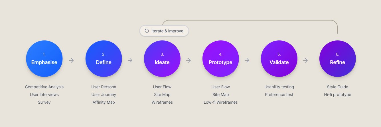
04 · The Bank · Fintech

Pluto.

While Gen Z and Millennials are more inclined to invest than previous generations, there is a gap in the market for products that resonate with their communication styles and habits. Pluto is a slightly gamified investing and wealth management platform that facilitates peer connections and support, while offering formal guidance about risks, analyst ratings, and learning tools.

School
CareerFoundry
Focus
UX/UI Design
Timeline
Nov '20 – Jul '21
Pluto — final UI hero
The
problem
The gap
Younger generations are interested in investing, but existing financial products are designed for experienced investors — heavy on technical terminology, light on social connection and learning scaffolding.
The opportunity
An investing platform built for how this generation actually communicates — with peer visibility, optional social features, and progressive financial education layered into the experience.
How I
worked
Process diagram
Competitive
analysis

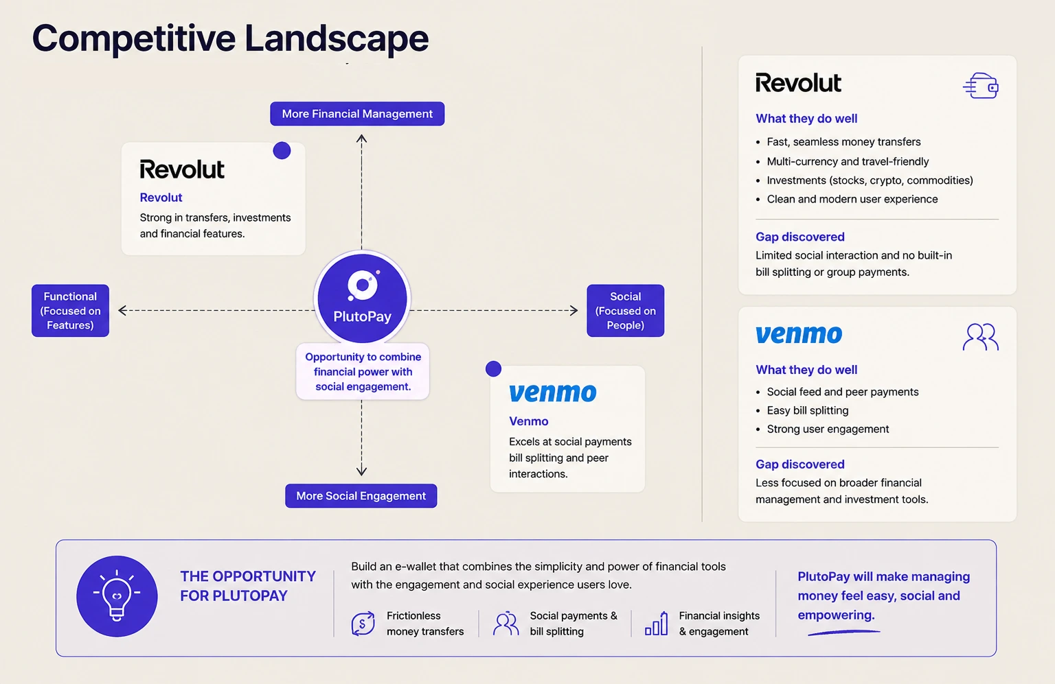
I conducted a competitive analysis of Revolut and Reddit using the S.W.O.T. framework — two products that younger investors were already using, albeit for different purposes. The goal was to identify market gaps and understand what was already working.

Further research confirmed a growing interest in investing among younger generations, alongside a clear frustration with the complexity and inaccessibility of mainstream financial tools.

Competitive analysis — Revolut and Reddit
User
survey

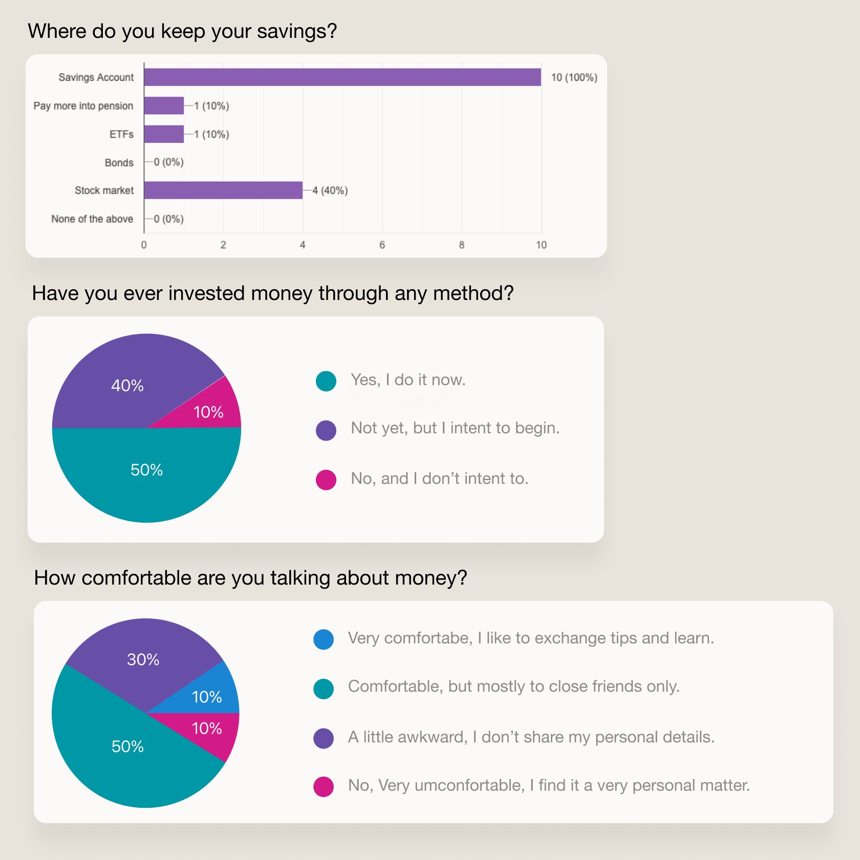
I ran a survey with participants aged 25–40 — a fast method to collect quantitative data and validate early assumptions. Three themes emerged clearly from the responses:

1
Financial interests
Most non-experts liked the idea of using financial tools to grow their savings, but often lacked a personal interest in finance itself.
2
Social habits
Users felt more confident observing moves of other investors — but preferred keeping their own identity private when sharing experiences, using nicknames rather than real names.
3
Information overload
Users who weren't financial experts felt overwhelmed by excessive technical information — and often gave up on investing as a result.
Survey — financial interests data Survey — social habits data
Key
hypotheses
Personalisation
Hypothesis
A personalised feature could keep users informed about news relevant to their specific investments and financial goals — bridging the gap between interest and engagement.
Private social
Hypothesis
A social feature allowing investors to exchange ideas while keeping their real identity private could unlock the collaboration benefit without the vulnerability.
Simplicity
Hypothesis
Simplifying terminology and allowing users to observe experienced investors could give beginners the starting point they need — reducing abandonment.
User
personas

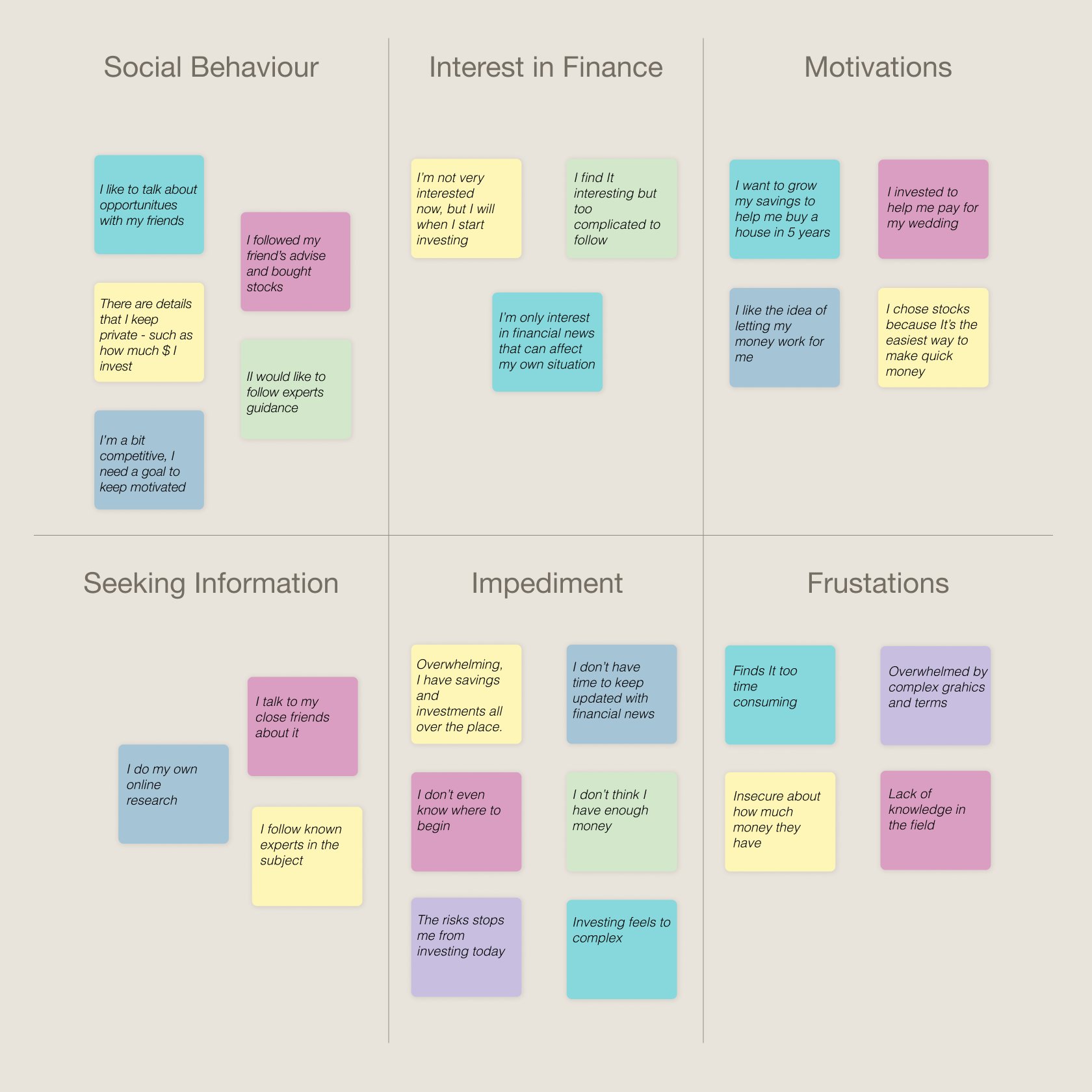
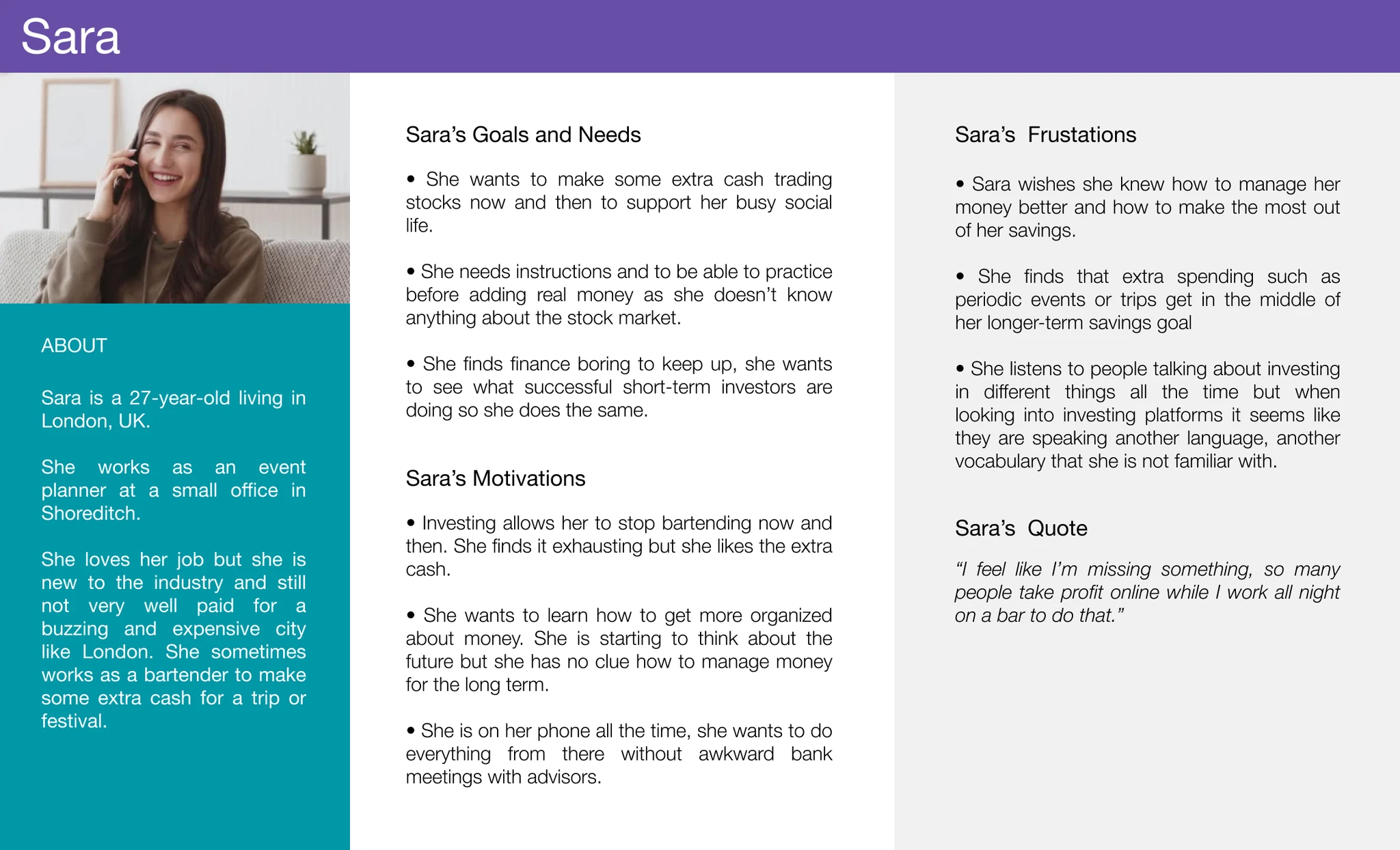
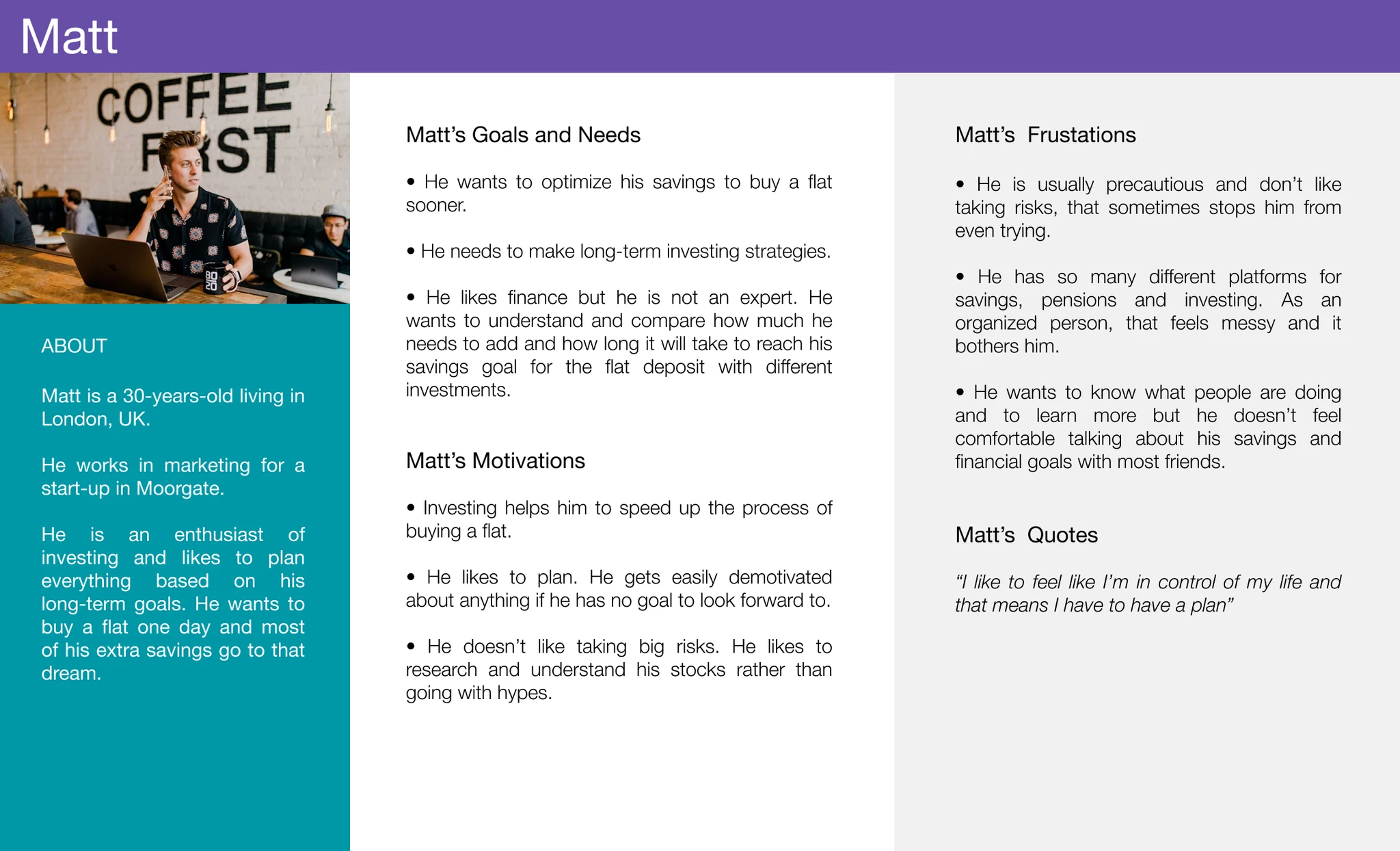
Based on research findings, I developed two personas — Sara and Matt — to anchor design decisions in distinct but representative user needs.

Sara
Spontaneous personality, open to risk, focused on the present moment. Sara wants to try investing but is easily overwhelmed — she needs a quick entry point and reassurance that she's making sensible choices.
Matt
Prefers structure and long-term goals. Matt wants to understand exactly what he owns and why. He values data and professional analysis, but doesn't want to drown in it.
Persona — Sara Persona — Matt
User
flows

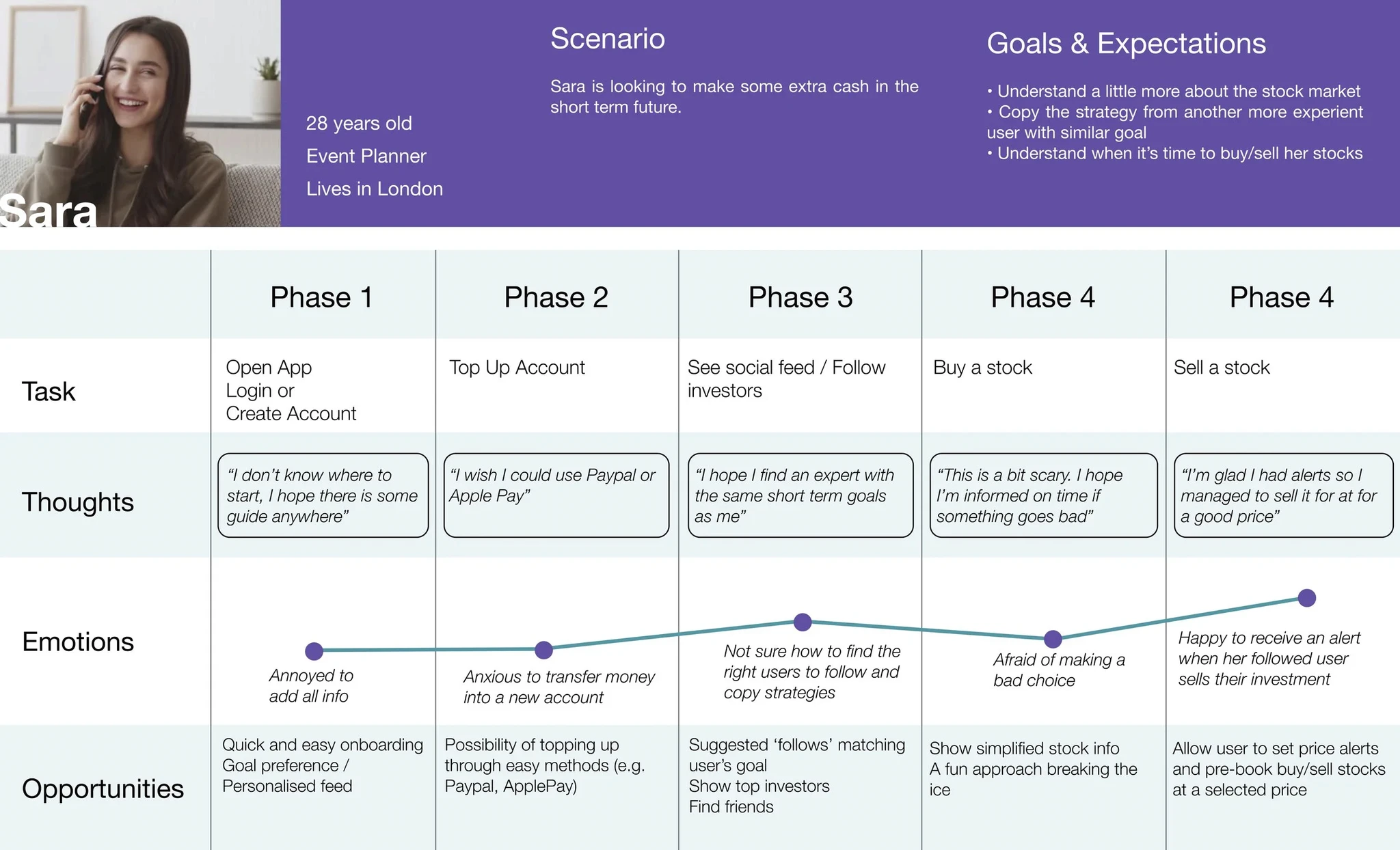
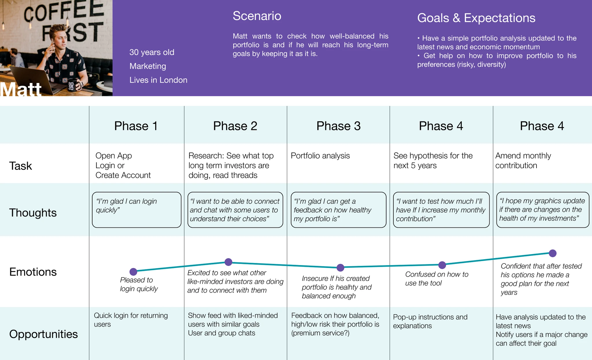
Keeping both personas in mind, I mapped out key user flows — outlining the paths and functions needed to achieve specific goals, and surfacing user expectations and feelings at each step.

User flow — Sara User flow — Matt
Card sort &
sitemap

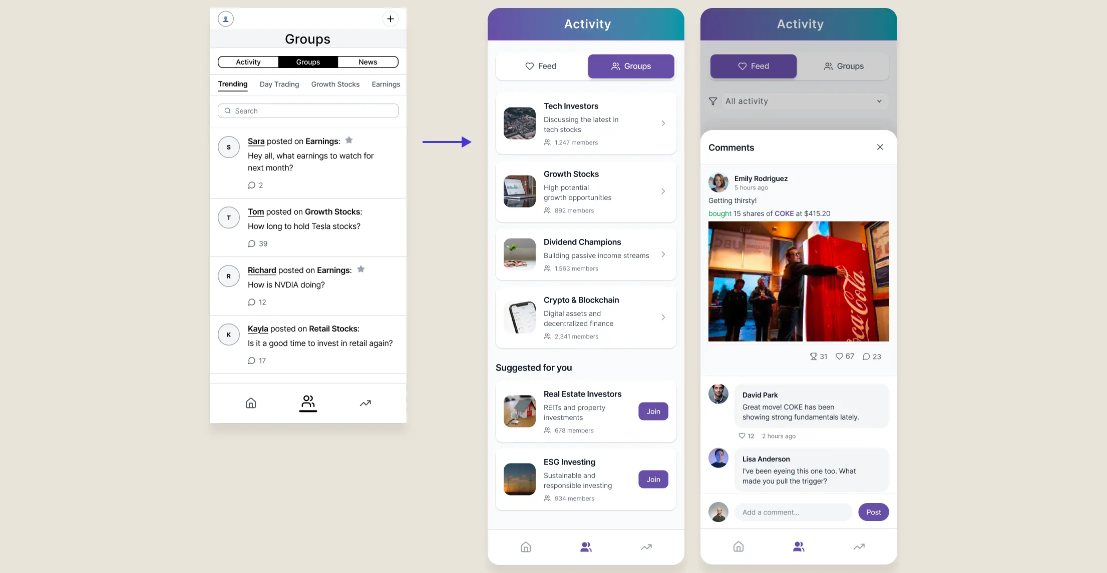
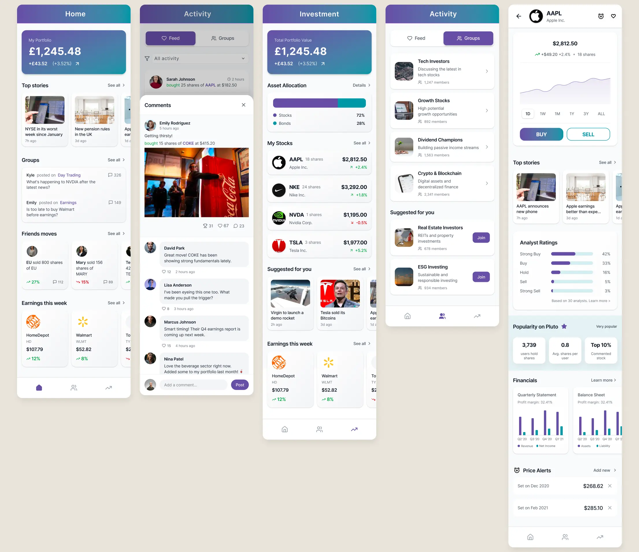
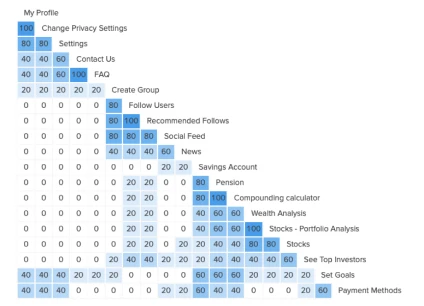
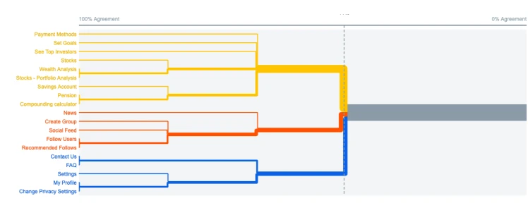
I ran a hybrid card sorting exercise — combining open and closed methods — to understand how users naturally grouped the platform's features. The results directly informed adjustments to the sitemap.

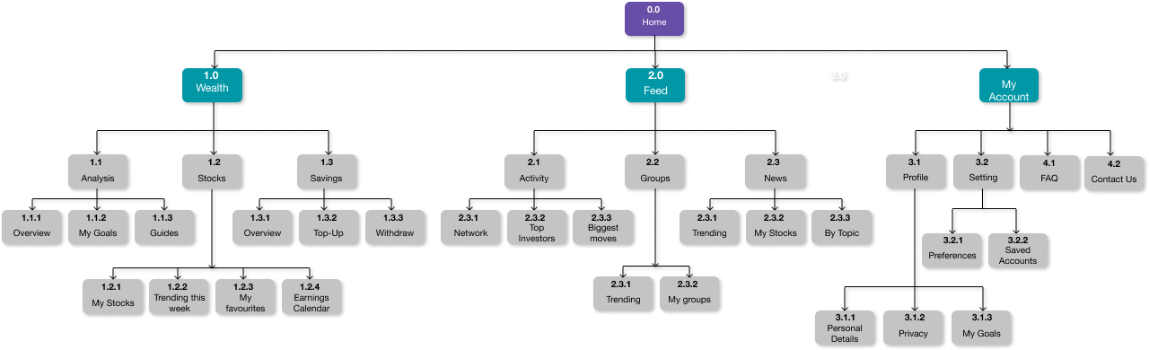
From there, I created a sitemap to organise the platform's hierarchy: main sections, subdivisions, and filters. This became the structural foundation for all subsequent design decisions.

Card sort — results Card sort — groupings
Sitemap — full information architecture
Initial
wireframes

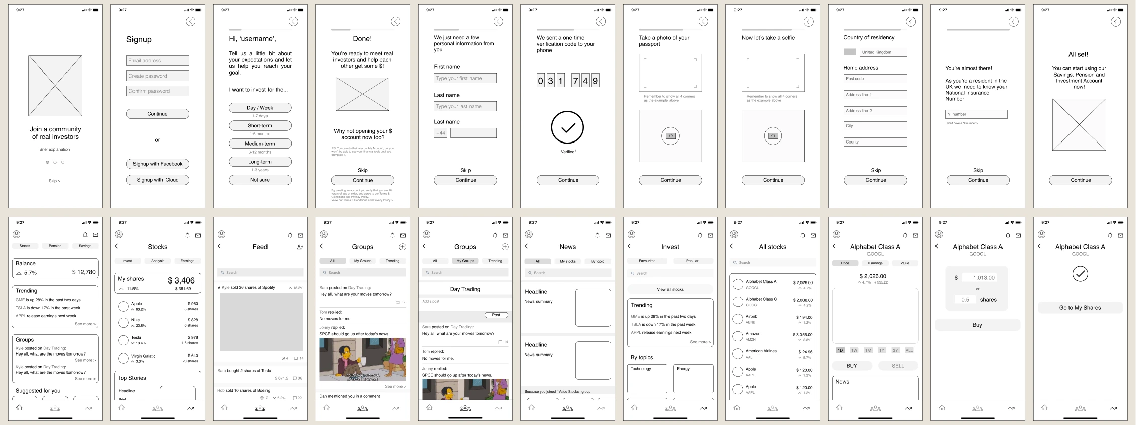
With the site structure in place, I began sketching initial interface ideas — translating the information architecture into screen layouts and exploring how the key interactions would work at low fidelity.

Initial wireframes — key screens
Usability
testing

I ran usability testing with 6 participants aged 28–40, all familiar with UK online banking. Sessions were conducted remotely via Zoom using a structured test script. Findings were organised using a Rainbow Spreadsheet and rated with Jakob Nielsen's severity scale, then mapped into an affinity diagram to surface patterns.

The goal was to observe whether features felt intuitive, and whether users understood Pluto's proposition — not just whether they could complete tasks.

Six critical issues were identified:

1
Home screen
Needed refinement based on pain points from user testing and observed behaviour data.
2
Stocks section
Too many clicks required to reach key content. The purpose of the 'All' landing page was unclear.
3
My Groups
Also required too many clicks to access. Same 'All' landing page confusion appeared here too.
4
Registration process
Separate registration for the social profile and the financial account was confusing — users expected a unified flow.
5
Onboarding UI
Instructions were too small and included excessive text, increasing cognitive load at a critical first-use moment.
6
Stock purchase
Users were uncertain which account funds would be withdrawn from when buying a stock — a critical ambiguity for a financial product.
Home
screen

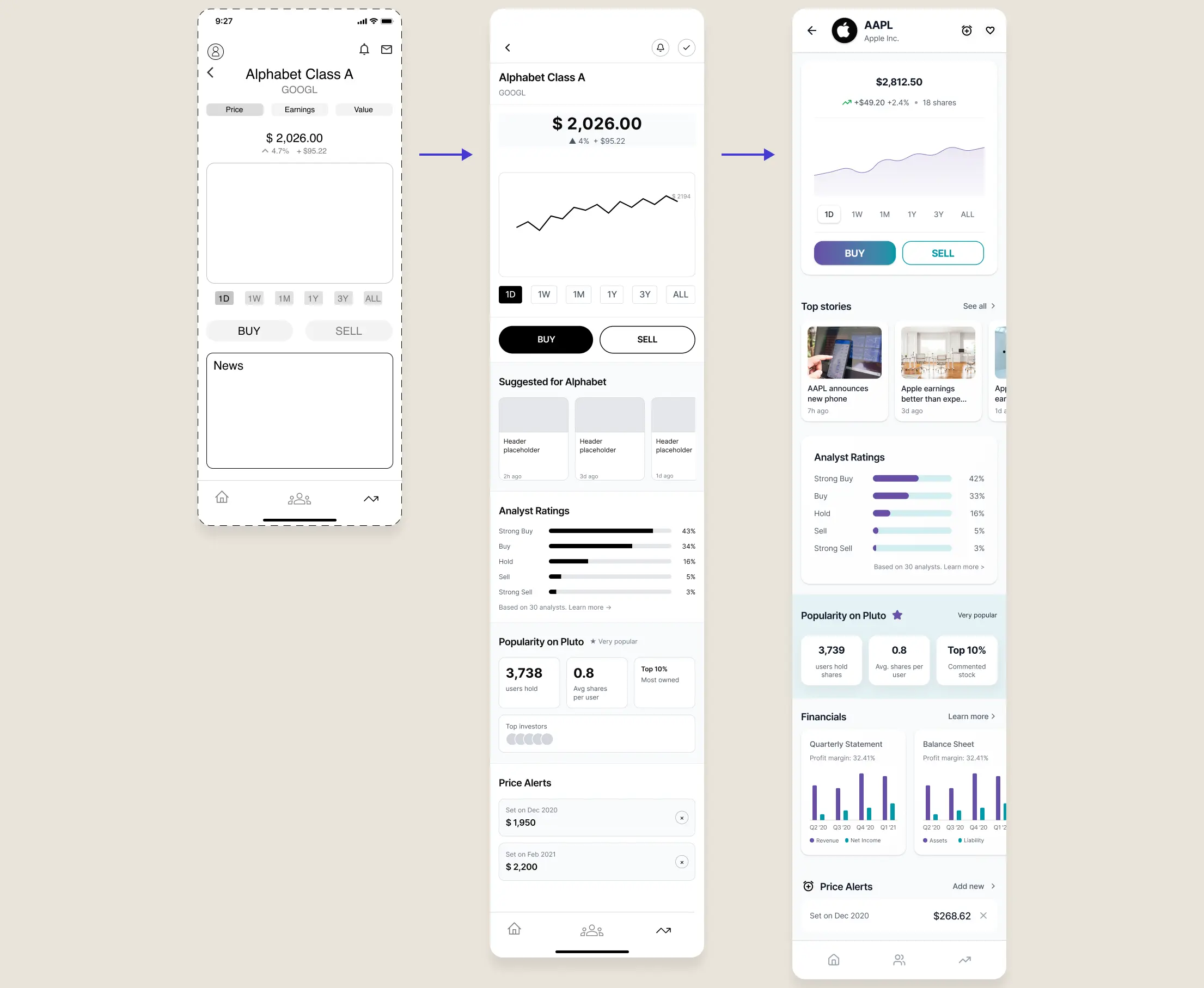
Using a combination of pen, paper, and Figma, I iteratively increased prototype fidelity. Through user testing and peer reviews, I gathered enough signal to refine the design and establish a brand identity that is simple but recognisable.

I also ran a preference test on the landing screen naming. Of 13 participants, 8 preferred 'Home' over 'Pluto' as the header — a small but meaningful change that reduced confusion about where users were in the app.

Home screen — wireframe to final UI
Stocks
section

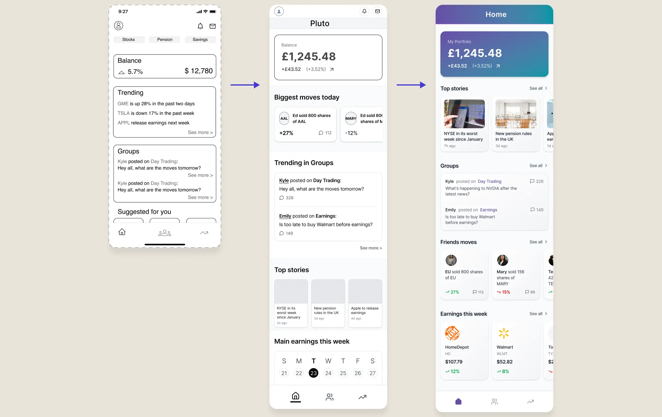
The original wireframe included multiple sub-sections and a header navigation with controls — adding unnecessary complexity at this stage. I explored different content organisations and simplified the structure to reduce reliance on sub-menus.

Before
Multiple sub-sections with header navigation controls. The 'All' landing page had an unclear purpose, requiring extra clicks to reach relevant content.
After
A high-level portfolio overview surfacing key insights first. Content grouped into clear sections with 'See all' actions for deeper exploration — better hierarchy, less cognitive load.
Stocks screen — wireframe to final UI
Feed &
social

Users were unclear about the purpose of the Feed — it combined social activity, group discussions, and news in a single space without clear hierarchy. I resolved this with two changes:

Before
News mixed with social activity and group discussions. Comments used a drop-down that became inefficient with longer threads — users had to keep expanding and collapsing replies.
After
News removed from the Feed and repositioned into Homepage and Investments — where it's contextually relevant. Comments moved to a modal, providing a scalable, focused space for conversation.
Feed & social — wireframe to final UI
Pluto
complete
Pluto — final UI complete screens
Get in touch
a.galvao@outlook.com
Next project
About me →