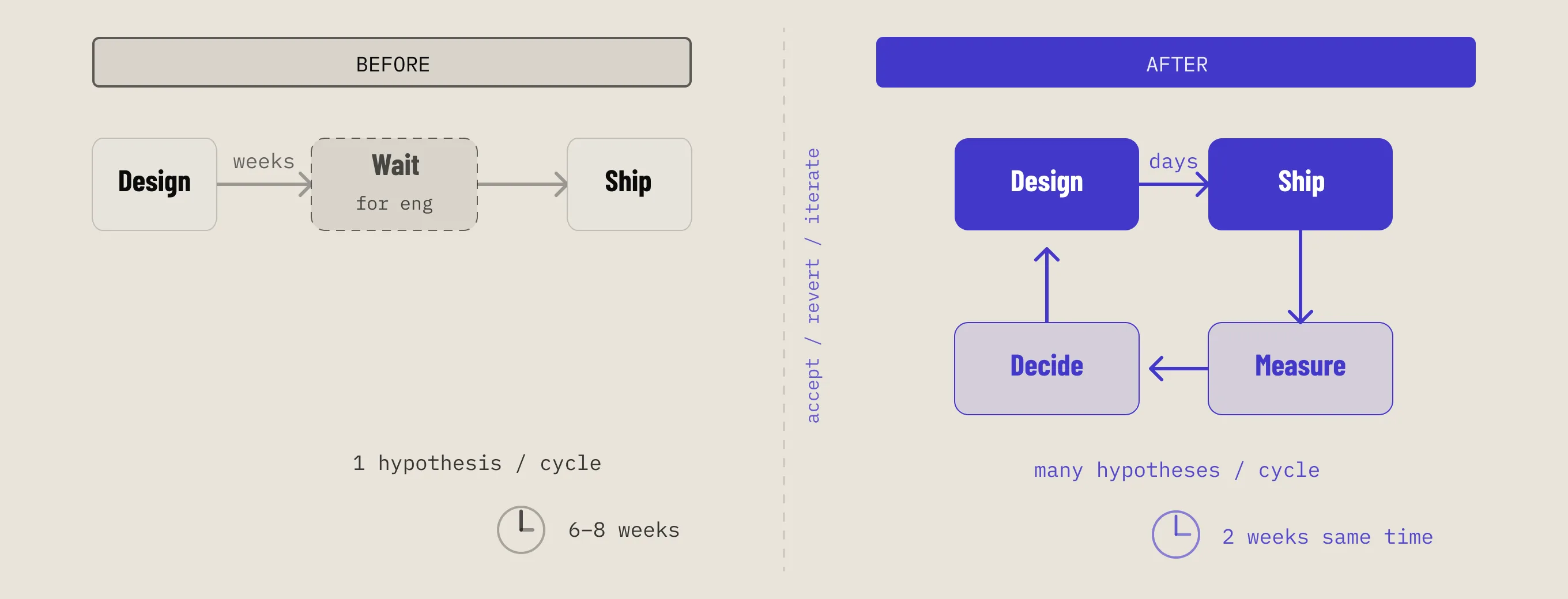
A design system built at the right moment, shaped by real constraints, and deliberately compromised in ways that made it stronger. Not a Figma file that lived separately from the product — a shared foundation that two people actually shipped with.
When I joined OneID, the product was one year old. The previous designer had built something functional — a basic Figma library covering colour, type, and a handful of components — but the product itself was fragile. One verification flow, hard-coded, embedded in an iframe inside customers' pages. No front-end developer. Every copy change was an engineering task that took weeks.
Two things changed when I arrived. The company had commissioned a rebrand from an external agency. And a front-end developer was being hired.
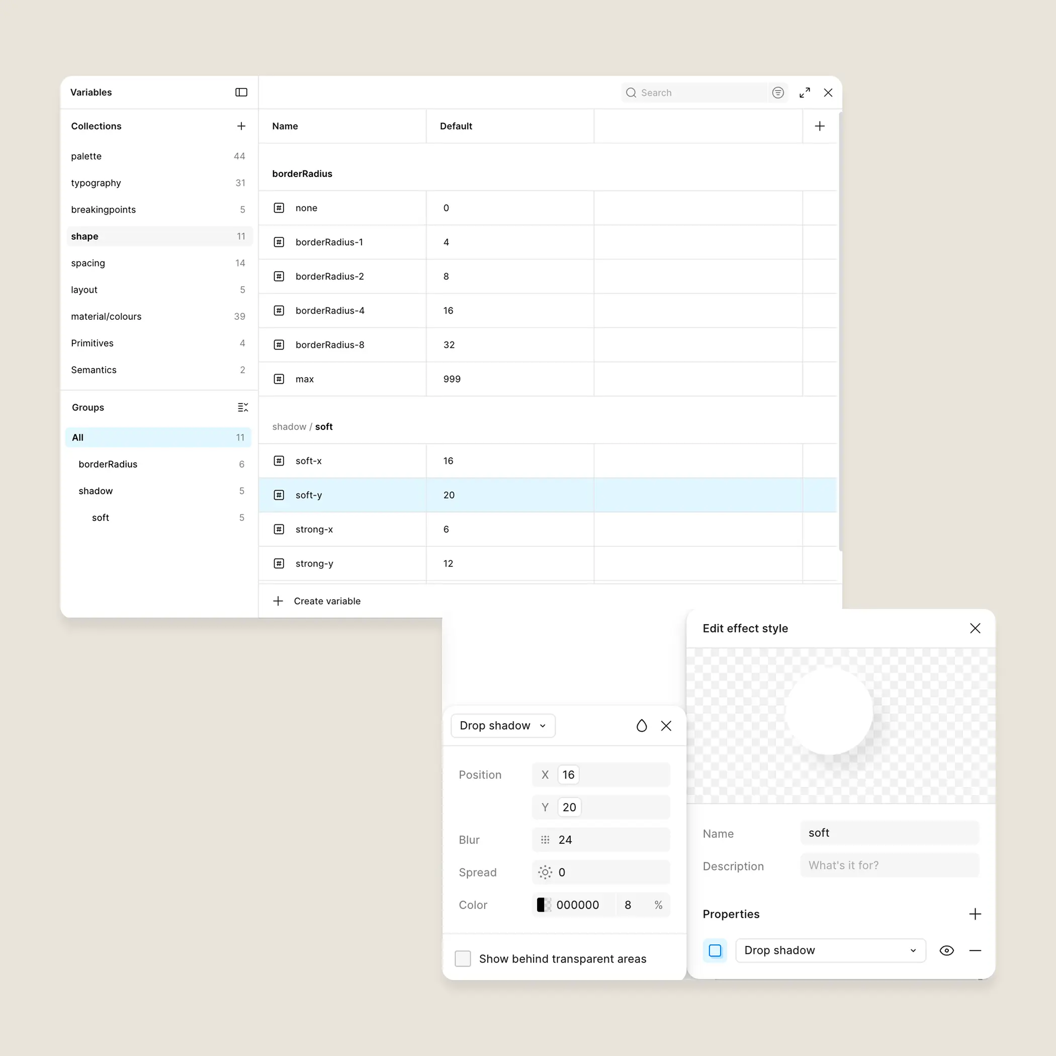
The foundation wasn't components — it was a decision about language.
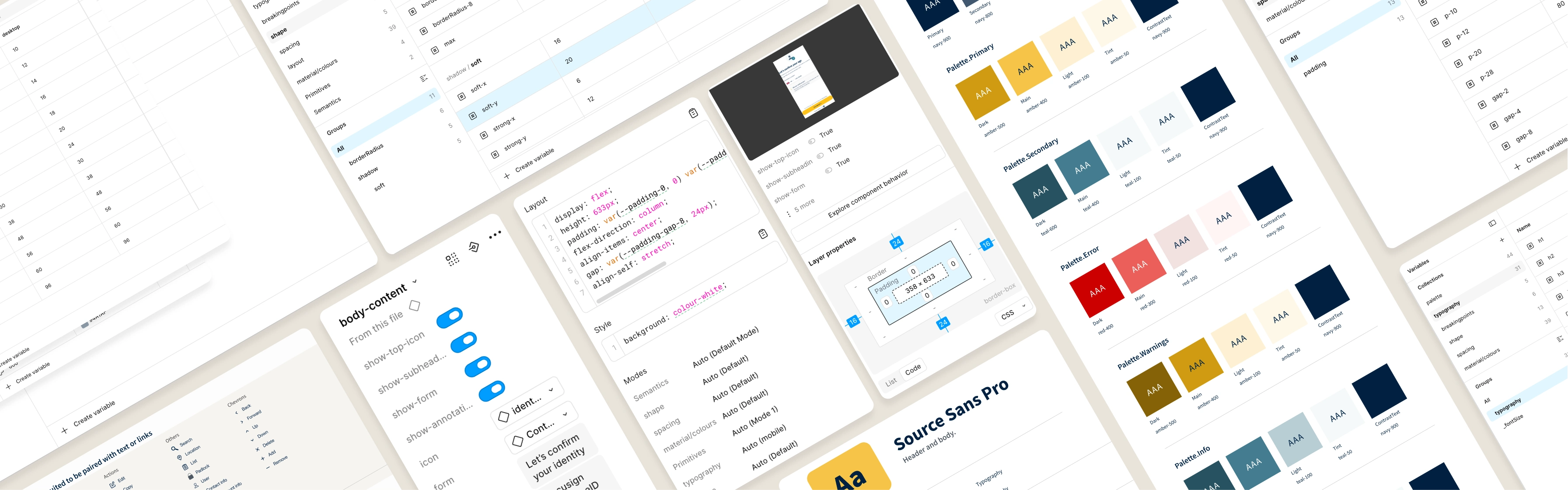
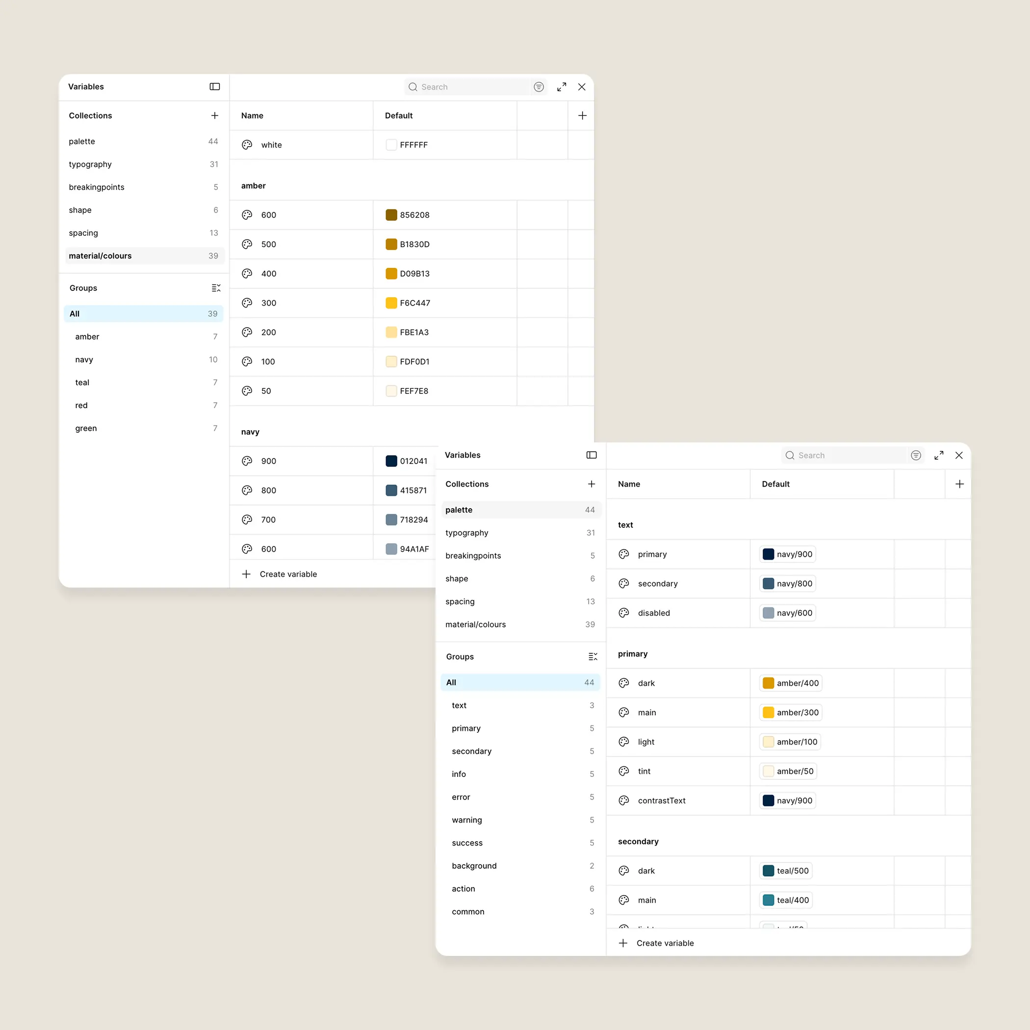
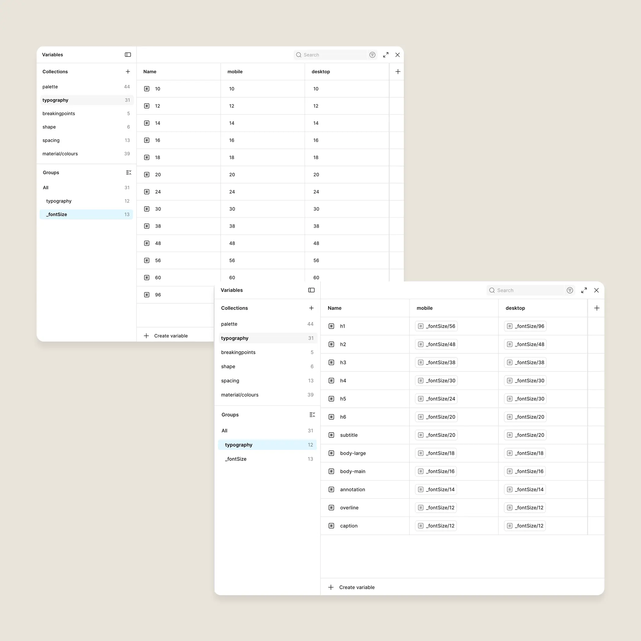
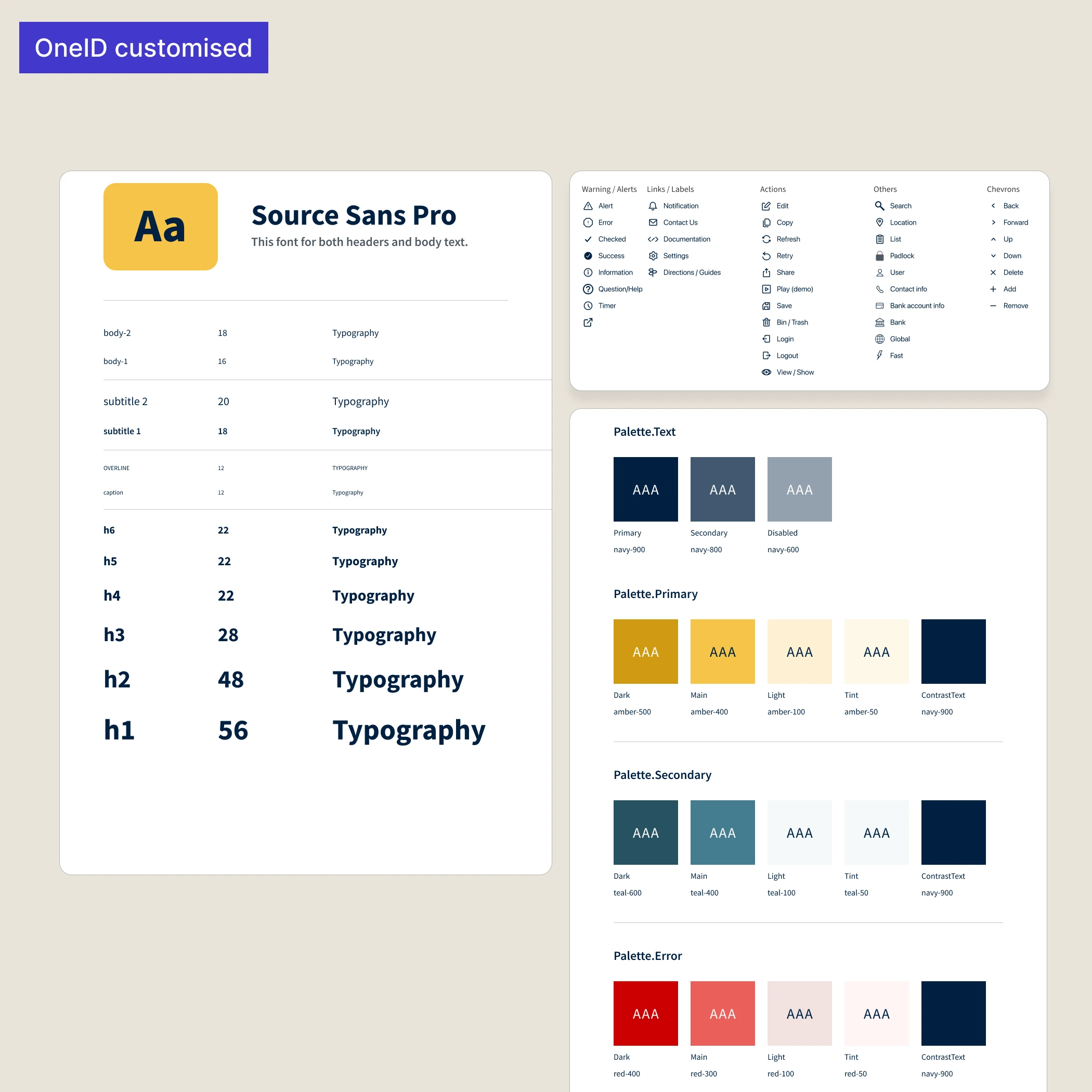
I structured the token system in two layers. Primitive values first: the raw numbers and hex codes. Semantic aliases on top: names that described intent rather than appearance. action-primary rather than indigo-600. feedback-error rather than red-400. Typography followed the same logic — a size scale at the primitive level, named styles built on top so that heading-2 could change its underlying size without anything breaking downstream.
The reason for this wasn't aesthetic tidiness. It was anticipating a rebrand that was already coming, and a product I knew would grow.
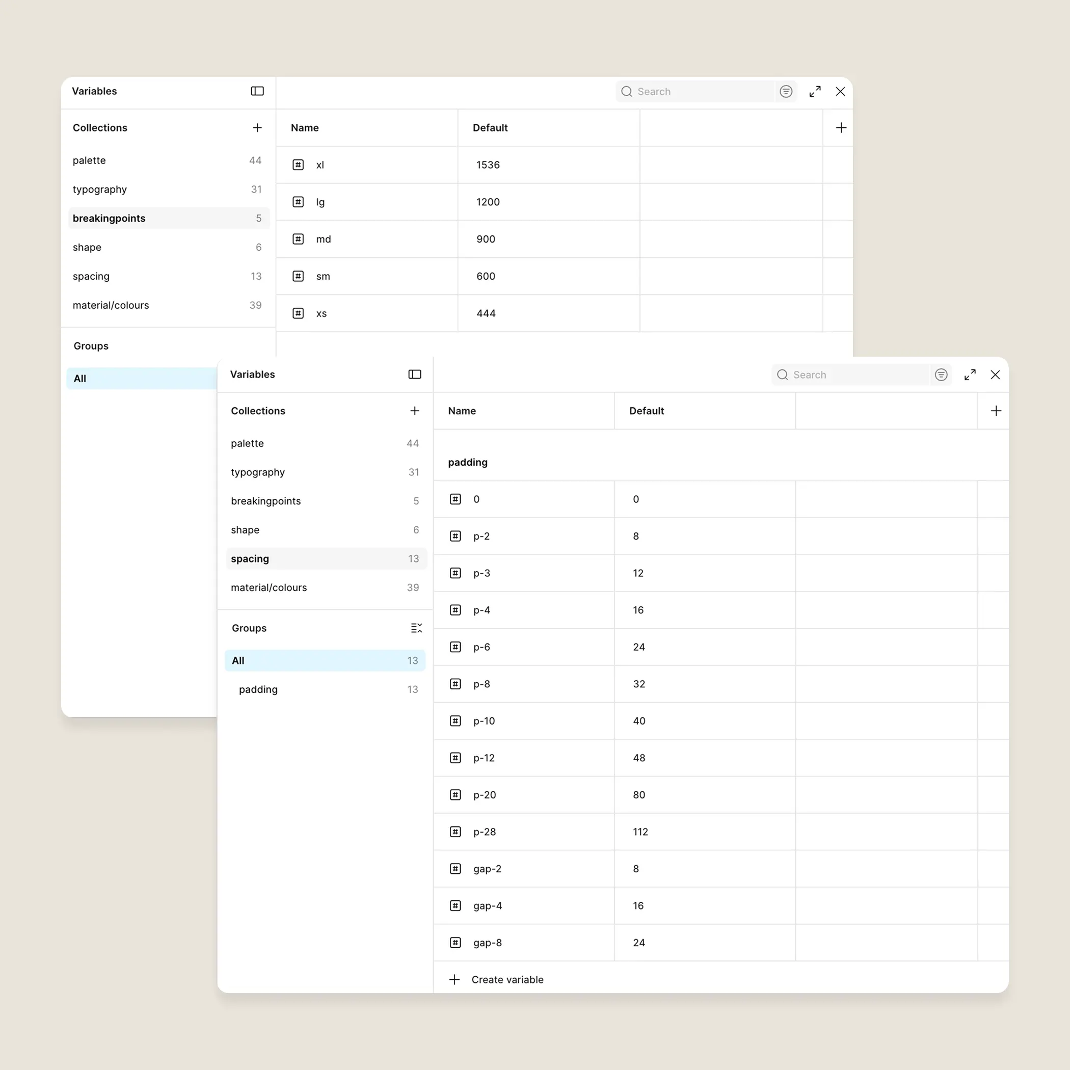
Spacing, border radius, and breakpoints followed the same pattern — defined as variables rather than magic numbers, so that when the front-end arrived, there was already a handoff layer waiting.
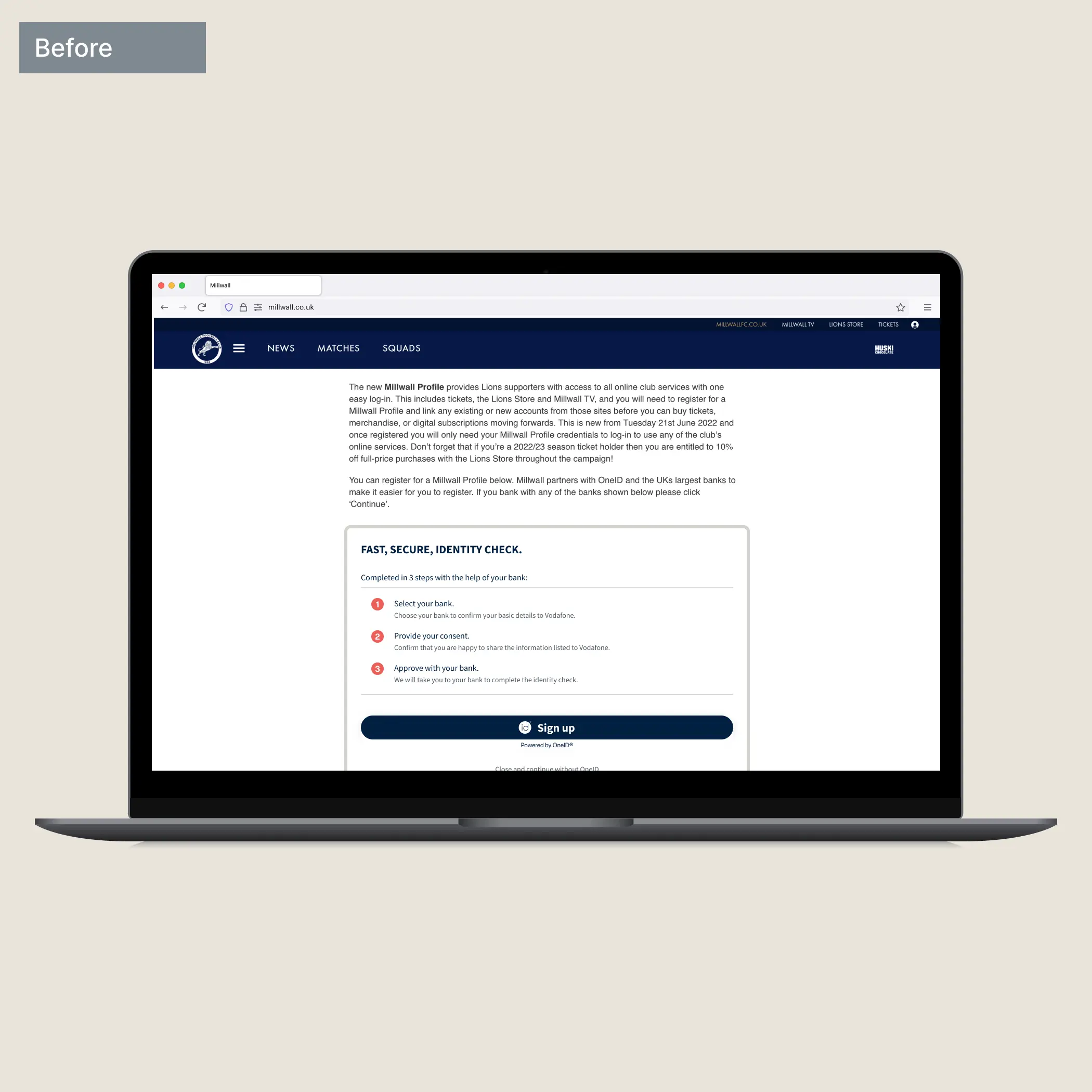
The old product lived inside customers' iframes. They had no consistent way to embed it — mismatched fonts, broken responsiveness, accessibility unconsidered. Moving to a controlled environment (modal or new tab, configurable by the customer) was a backend request I immediately agreed with.
It gave us back control. It also unlocked something we hadn't planned for: standalone URLs that could be triggered by email or QR code, opening distribution channels that hadn't existed before. A structural decision with a longer tail than anyone anticipated.
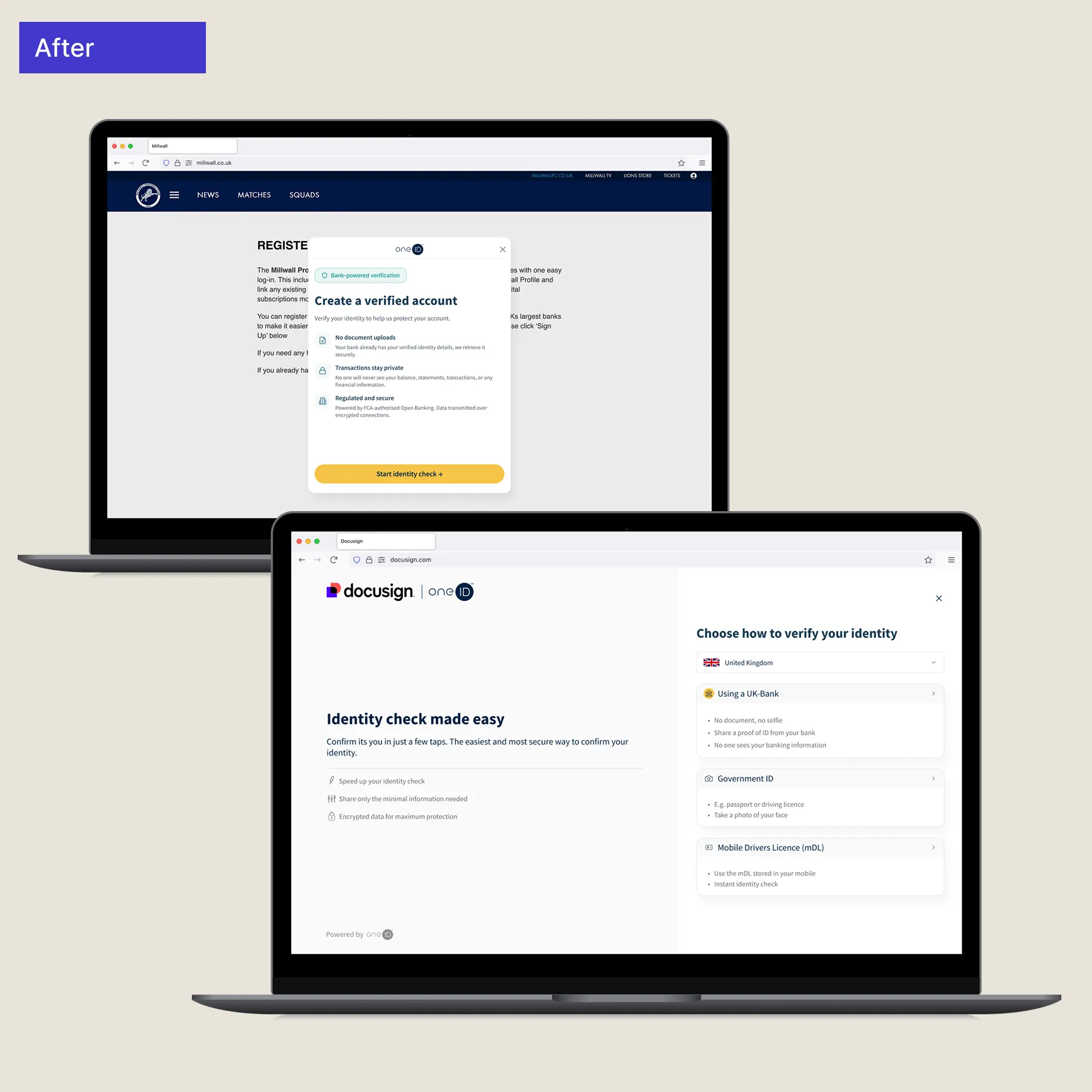
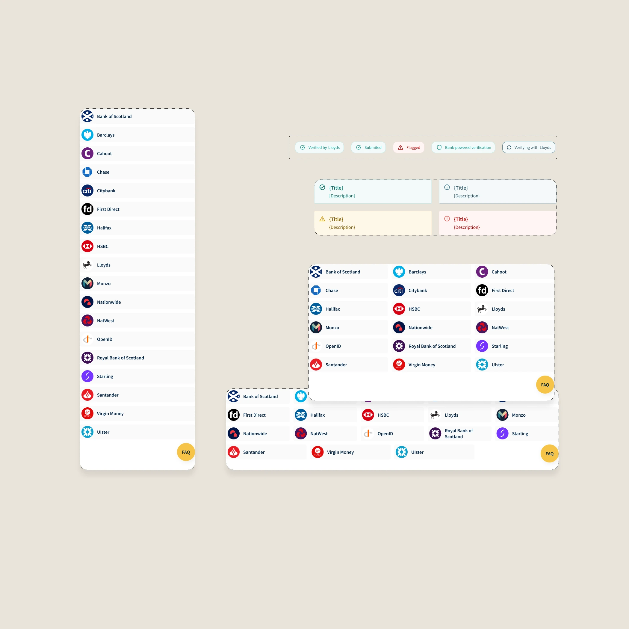
The verification journey runs on a single layout component with three states. Not three separate templates — one component that knows where it is.
Mobile is content-only. Tablet introduces a hero panel stacked above — the brand has room to breathe without competing with the task. Desktop splits them into columns: hero anchored left, content in a right-hand panel with adjusted padding.
The content section was designed to behave identically on mobile and desktop — same component, padding as the only variable — so anything built for one worked on the other without redesign.
Under the hood, this is three layout components spanning five breakpoints. Mobile (XS) is content-only — no hero, no chrome. Compact (S, M) introduces a small hero stacked vertically above the content. Expanded (L, XL) shifts to a two-column system: full hero pinned to the left, content wrapper to the right. The body content itself never changes — only the container around it does.
Each screen component had defined properties — text content, show/hide toggles, variants for state — so that spacing and layout were decisions made once, not renegotiated per ticket.
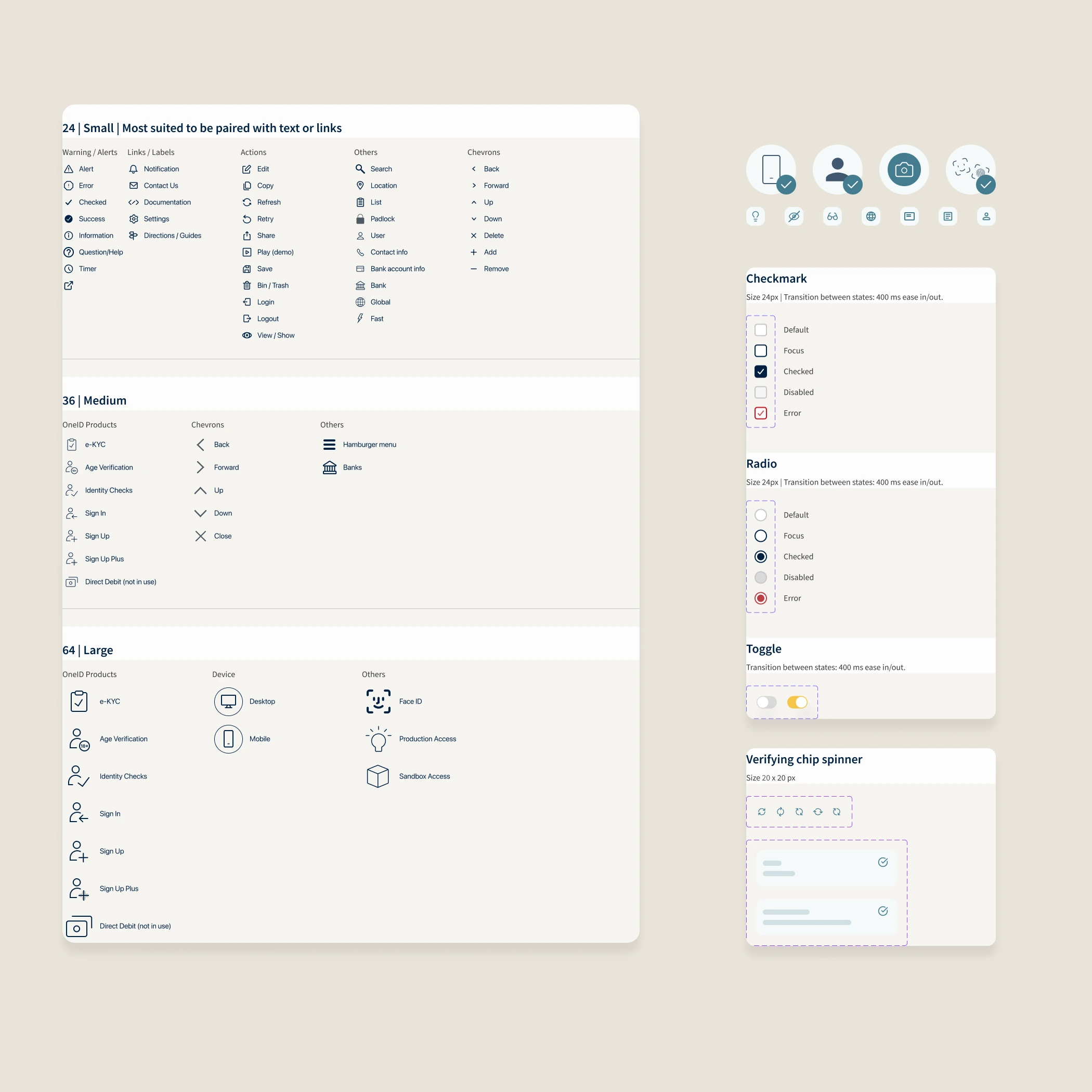
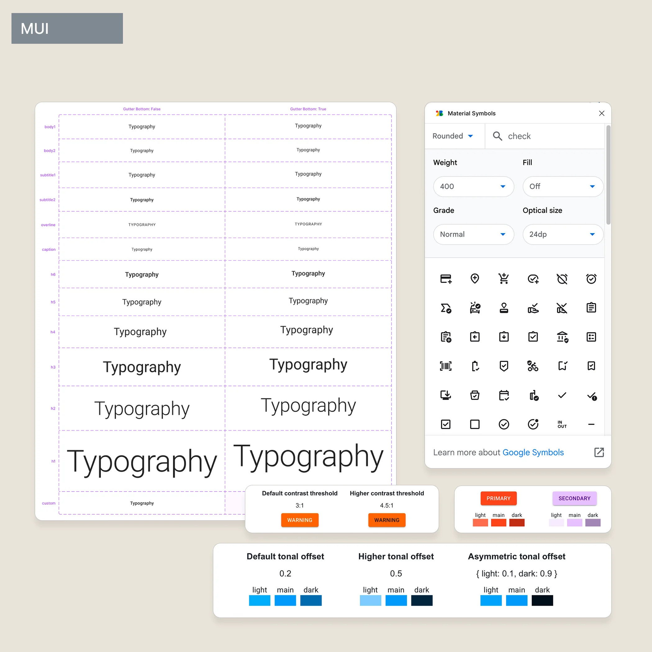
I collected and rationalised an icon set, mapping it to MUI's library ahead of time. A small set of custom illustrations were built from scratch for the key moments in the verification journey.
When the front-end developer joined, she wanted to build in Storybook using MUI — a library she knew well and could move fast with. My first instinct was to push back. My second instinct was to ask what the product actually needed.
So I adapted. I reconciled the colour tokens to MUI's theming system. I swapped some custom icons for MUI equivalents where they matched closely enough. In return, I gained something useful: mature table components, form patterns, interaction states — things I could apply our visual layer to rather than build from zero.
It wasn't what I'd originally intended. But it was the right call. The system became something two people actually used, not a Figma file that lived separately from the product being built.
The system also became the foundation for everything built afterwards — the Self-Service Portal, the Management Console. New components were added as the product grew. Some were refined. None of it required a rebuild.
Visual accessibility was part of the process from the start — colour contrast checked at every design decision. Rigorous WCAG AA and ARIA auditing came later, as the product matured and compliance requirements sharpened.
If I were doing it again, I'd push for structured accessibility testing earlier — not as a retrofit when it becomes a requirement, but as a design constraint from the first component.