03 · The Shop · Internal Tools

Self-Service
Portal.

OneID's self-service portal is a standalone interface designed to simplify how businesses manage identity verification — without needing an engineer. The goal was to let customers configure and manage verification flows independently, reducing onboarding friction and enabling smaller businesses to adopt the product at their own pace.

Company
OneID®
Role
UX/UI Designer
Timeline
Jun–Jul 2025
Self-Service Portal — hero
The
problem

Businesses integrating OneID needed developer support to configure verification flows and access results. That dependency created compounding friction across the product.

1
Engineering dependency
Onboarding depended on customers' engineering availability — often scarce for smaller businesses.
2
Integration confusion
Non-technical customers struggled to understand what was required to get started.
3
Growing support load
Support requests were increasing as adoption grew, creating operational overhead for the team.
These limitations slowed product adoption and made it harder to scale to smaller businesses who wanted to move fast but couldn't afford dedicated integration time.
Framing
the
approach

To help smaller businesses adopt OneID without increasing the internal support load, I designed a self-service portal where businesses could send verification requests, manage results, and receive a PDF-exportable audit trail — all without raising a ticket.

I worked through a structured discovery and design process to get there.

1
Analyse support requests and internal workflows
Understanding where the real friction was before designing anything.
2
Define MVP features and flows
Scoping what would be enough to test the concept and prove value.
3
Explore interface patterns
Designing for clarity and task-orientation over analytics or complexity.
Where
friction
lived

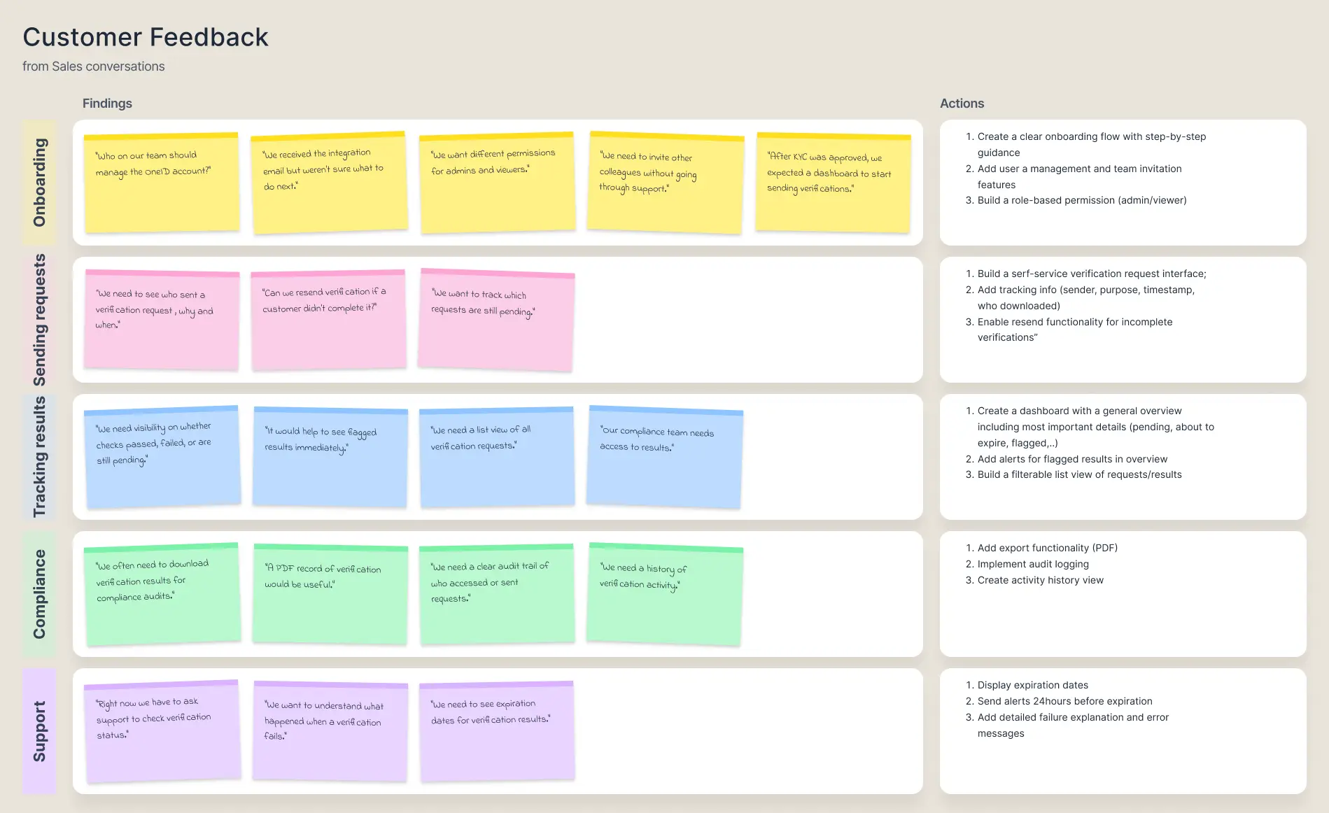
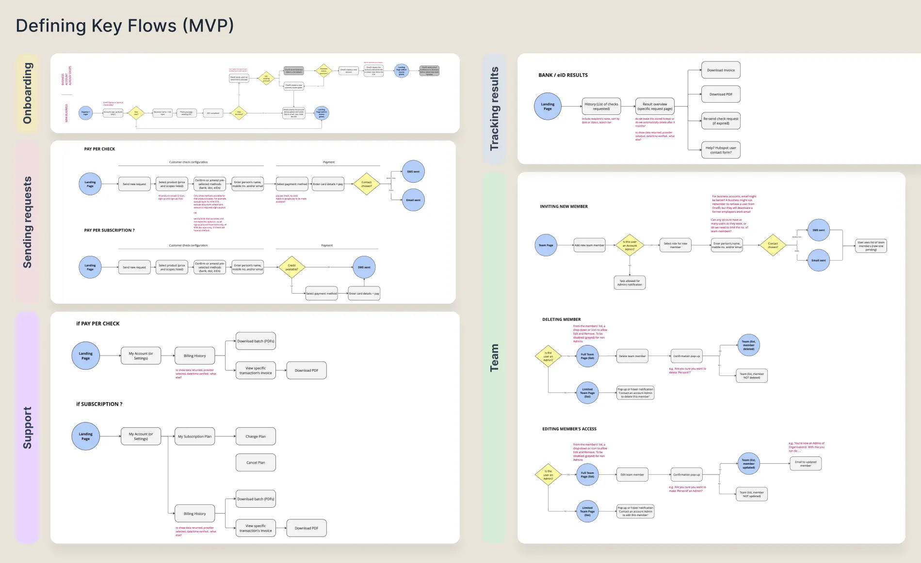
Research revealed that most onboarding friction occurred during initial configuration. Customers consistently struggled with three things:

What's available
Visibility gap
Customers didn't know which verification flows were available to them or how they differed.
How to configure
Complexity barrier
Configuration required technical knowledge most small-business customers didn't have.
What to provide
Data uncertainty
Customers weren't sure what data they needed to submit or what they'd receive back.
This shaped the core principle: the portal should prioritise clarity and progressive configuration rather than exposing complex settings upfront.
Research findings — support request analysis
Scoping
the
MVP

For the first release, the Product team and I decided to focus on Right to Work and Right to Rent checks. Both required the same verification method (document scanning) and were the use cases most often requesting a no-code solution.

The Head of Product and I collaborated to define the minimum features needed to launch and test the proof of concept. Three constraints shaped our decisions:

Configuration
Start with Right to Work and Right to Rent only. No configurable verification for MVP — a fixed, proven flow first.
Scalable structure
Architecture needed to support document scanning, bank checks, and credit reference agencies in future iterations.
Security
As a Government-certified provider, OneID could verify new portal users' identity quickly — essential given the sensitive data the portal would display.
MVP scope — feature mapping
Building
the
interface

With user flows and MVP requirements defined, I began designing the portal UI. This was an initial interface intended for stakeholder alignment and testing rather than final handoff. Most components came from the existing OneID design system, with minor improvements, new icons and tagging components.

The design was deliberately task-driven rather than metric-first. The dashboard prioritised actions over analytics — businesses needed to send requests, check results, and act on them. An analytics-heavy dashboard would have created cognitive load without adding value at this stage.

Testing
with
customers

I collaborated with Sales to run prototype walkthroughs with two customers who had previously requested a self-service portal. While broader usability testing would have been ideal, priorities later shifted toward enterprise clients — so this phase focused on exploratory interviews with those two customers specifically.

Three themes emerged from the feedback:

01
Excel exports
While PDFs were considered useful, customers mentioned Excel files are easier to feed into other platforms they use.
02
Activity status
Labelling everything as 'To-Do' vs 'Closed' was confusing for both customers — the status model needed more nuance so teams could distinguish results requiring action from those already resolved.
03
Email notifications
One customer suggested email notifications sent to whoever requested the verification, to prevent delays in acting on results.
Exploring
with
Figma Make

At this stage, Figma had just launched Figma Make. This was a good opportunity to explore its capabilities alongside the portal design.

I ran two parallel experiments. First, I asked Make to replicate my exact design and build the interactions. Second, I gave it the same structure and guidelines but no visual reference — I wanted to see a different interpretation of the portal UI.

Then I evaluated the output systematically:

Adopt
Dashboard scannable layout — Overview → Action → Details hierarchy worked well.

Activity filtering within the list frame — avoids conflicts with future new sections.

Action as text, not icon — clearer for non-technical users.

Logo configuration format — clean insert pattern worth keeping.
Avoid
Dashboard turned analytics-first — original design was task-driven; this shift would confuse the audience.

Inline action from activity list — updating status directly from the list view risks user error.

Simplified identity report — Make's version skipped essential compliance requirements.
Aligning
teams

To validate the portal concept, I built a full proof-of-concept prototype using Figma Make and shared it with internal teams.

The prototype covered three key areas:

1
User management
How businesses would invite and manage their team's access to the portal.
2
Verification management
Sending requests, tracking status, reviewing results and exporting audit trails.
3
Dashboard overview
A task-driven home screen surfacing what needs attention without overwhelming with data.
The prototype helped align engineering, product, and commercial teams around the portal direction — and created a foundation that could be revisited when the small-business segment becomes a priority again.

Following a change in leadership in September 2025, OneID shifted focus to large enterprise customers. Work on the self-service portal was paused — not cancelled. While it's frustrating not to see it live and iterated on with real user data, the strategic decision freed up capacity to focus on scalability for larger customers.

Interactive prototype — click to navigate
Expected
outcomes
Fewer
tickets
Customers managing flows independently — no engineering required
Faster
onboarding
Self-service configuration reduces time to integration
Wider
adoption
Lower barriers enable smaller customers to start without specialist support
What
this
built

The prototype clarified operational requirements for self-serve verification, helped internal teams align around a concrete direction, and created a reusable foundation for when small-business adoption becomes a strategic priority again.

The Figma Make experiment was also genuinely useful — not as a replacement for design thinking, but as a way to stress-test assumptions quickly and find unexpected solutions worth adopting. The structured Adopt/Avoid evaluation made the output immediately actionable rather than just interesting.

The biggest lesson: even work that doesn't ship has value if it sharpens the product thinking and leaves the team with something real to build from.

Get in touch
a.galvao@outlook.com
Next project
Pluto →