01 · The Apartments · Identity

OneID
Verification.

OneID lets people prove who they are without uploading a passport or taking a selfie. Instead, it uses their bank — an institution they already trust — to confirm their identity securely, in seconds. When I joined as the sole designer, the product was one year old and one method deep. Over three years, I helped turn it from a single verification flow into a flexible identity platform that 800,000 people a week now use.

Company
OneID®
Role
UX/UI Designer
Timeline
Jan 2022 — 2025
OneID Verification — UI overview
+47%
Increase in success rate
+15%
User adoption for key client
−91s
Time to complete for returning users
Understanding
the
problem

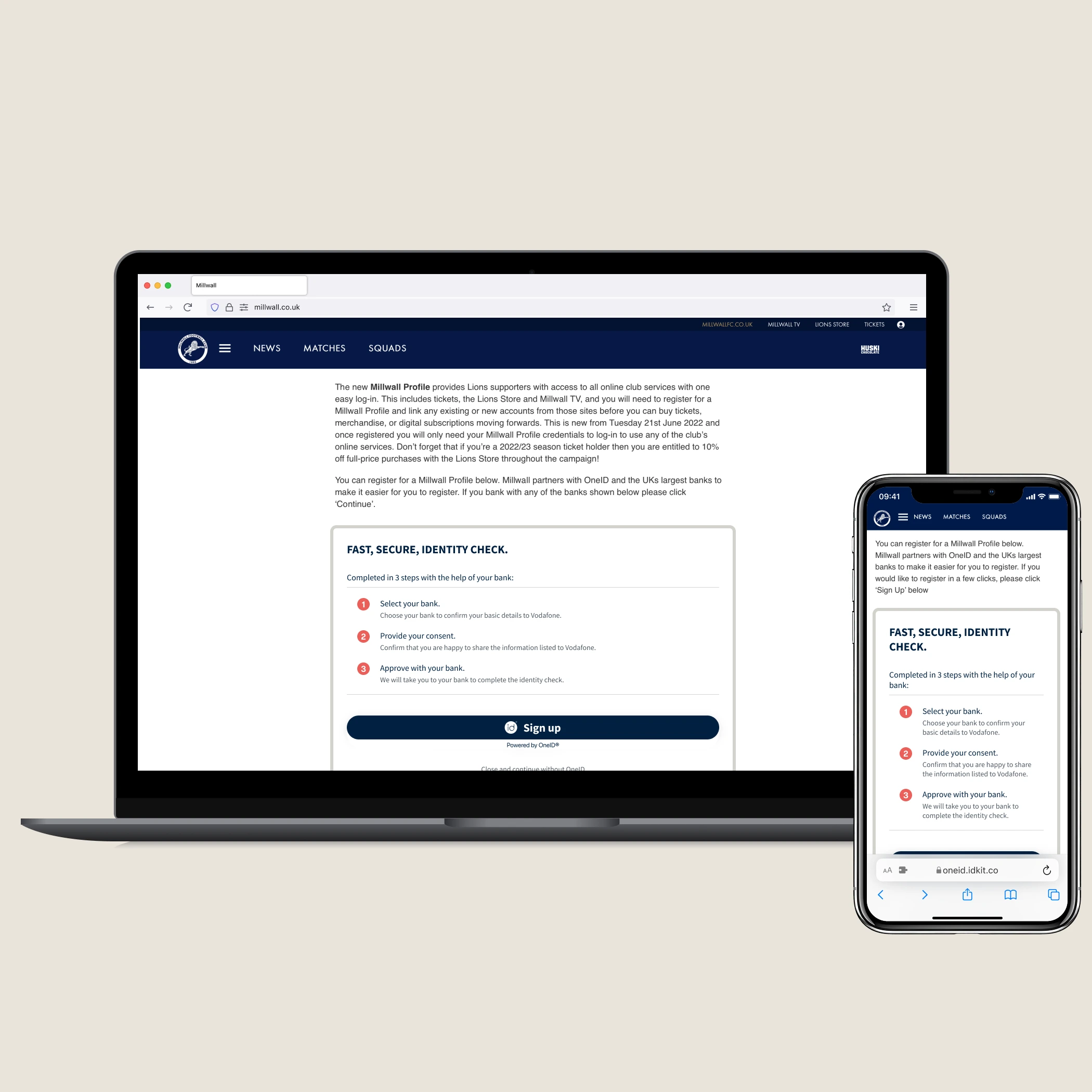
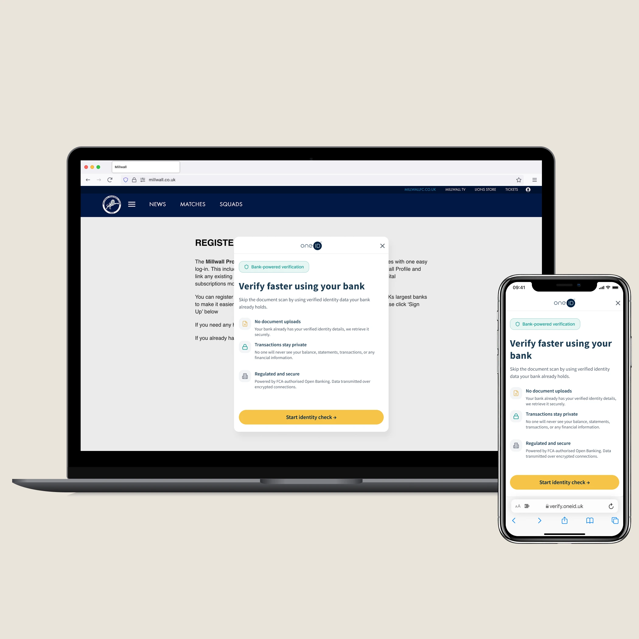
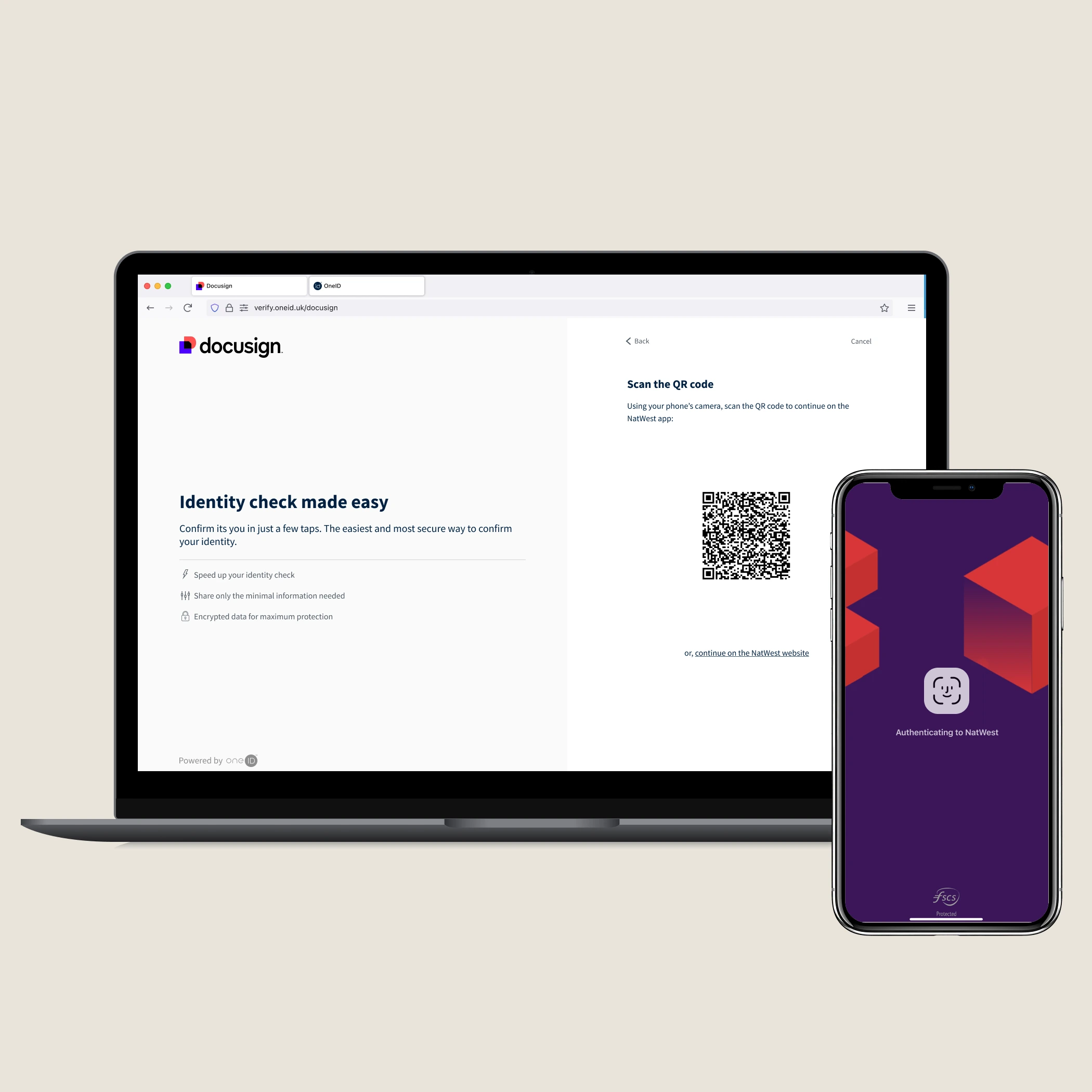
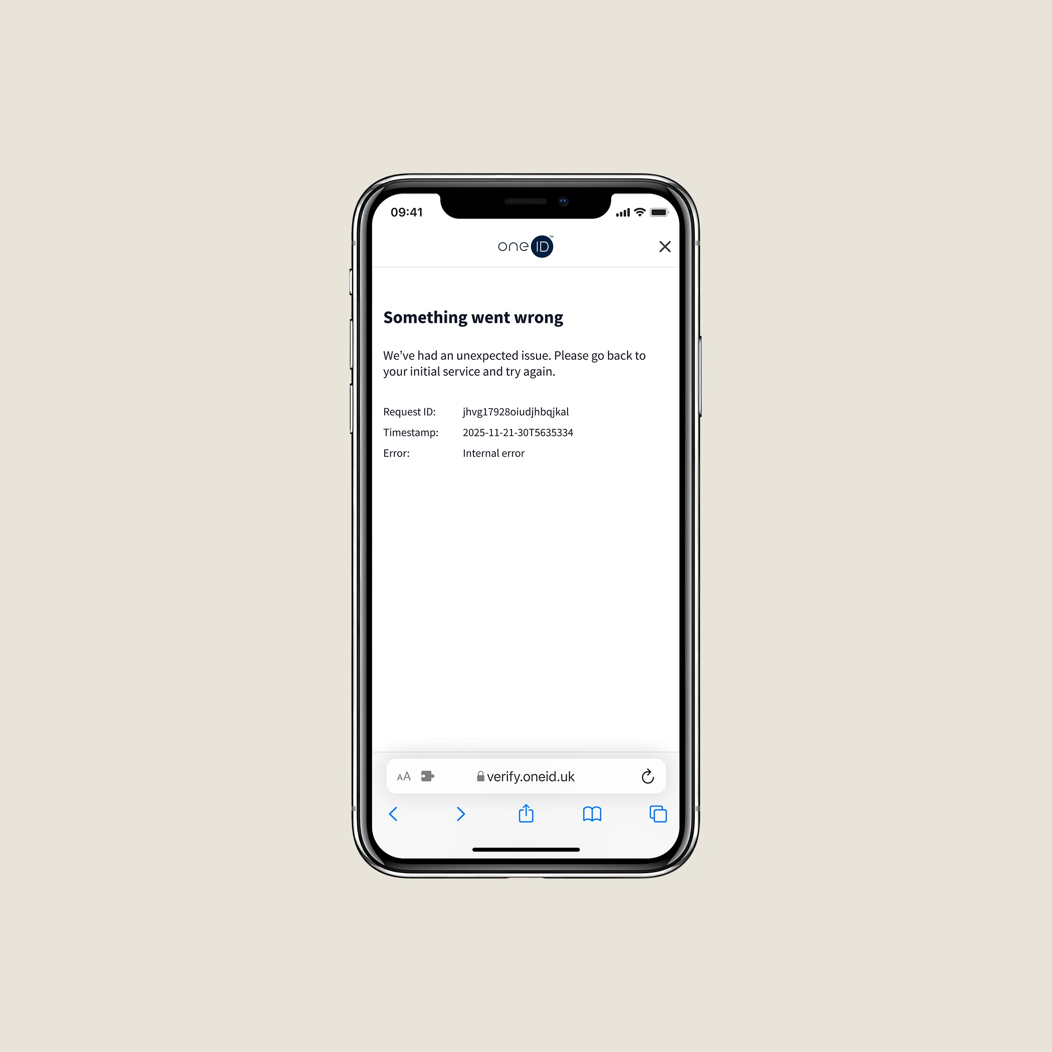
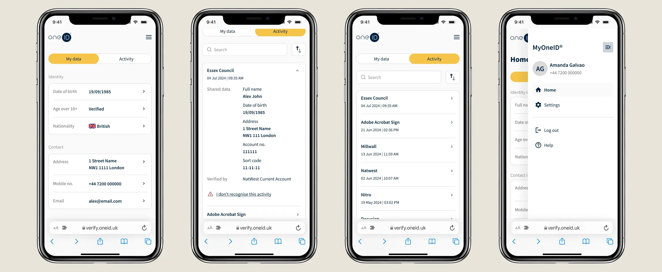
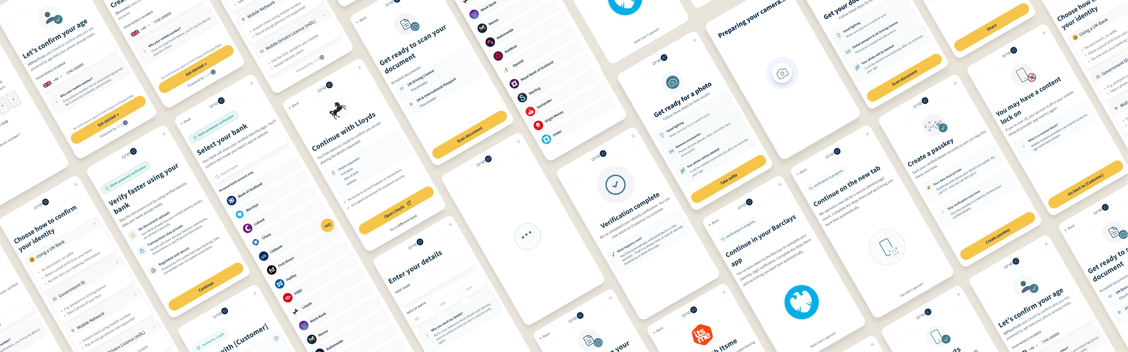
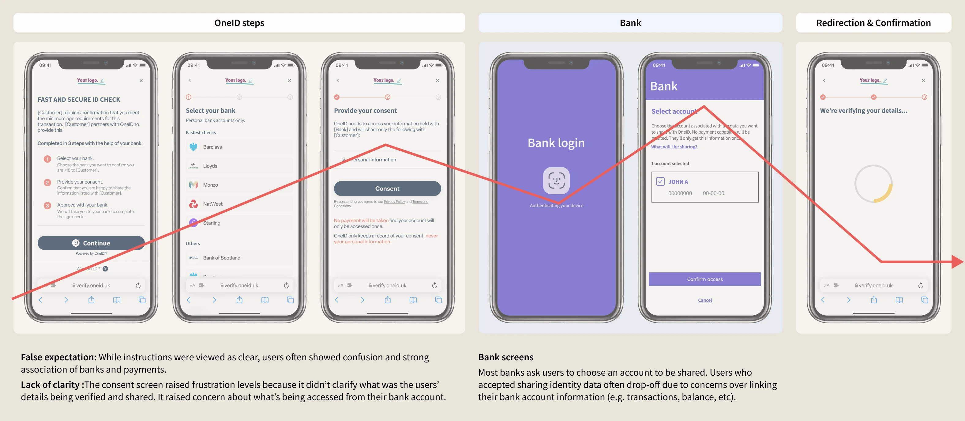
Identity verification is a moment of high stakes and low trust. You're being asked to hand over sensitive personal data to a service you may have just discovered. The bar for confidence is high, and the tolerance for friction is almost zero.

At OneID, that tension sat at the centre of everything. We had three groups of people with overlapping but often conflicting needs, and designing for one without the others created problems fast.

End users
Wanted speed and simplicity
But not at the cost of feeling exposed. Even when the friction was low, trust wasn't automatic.
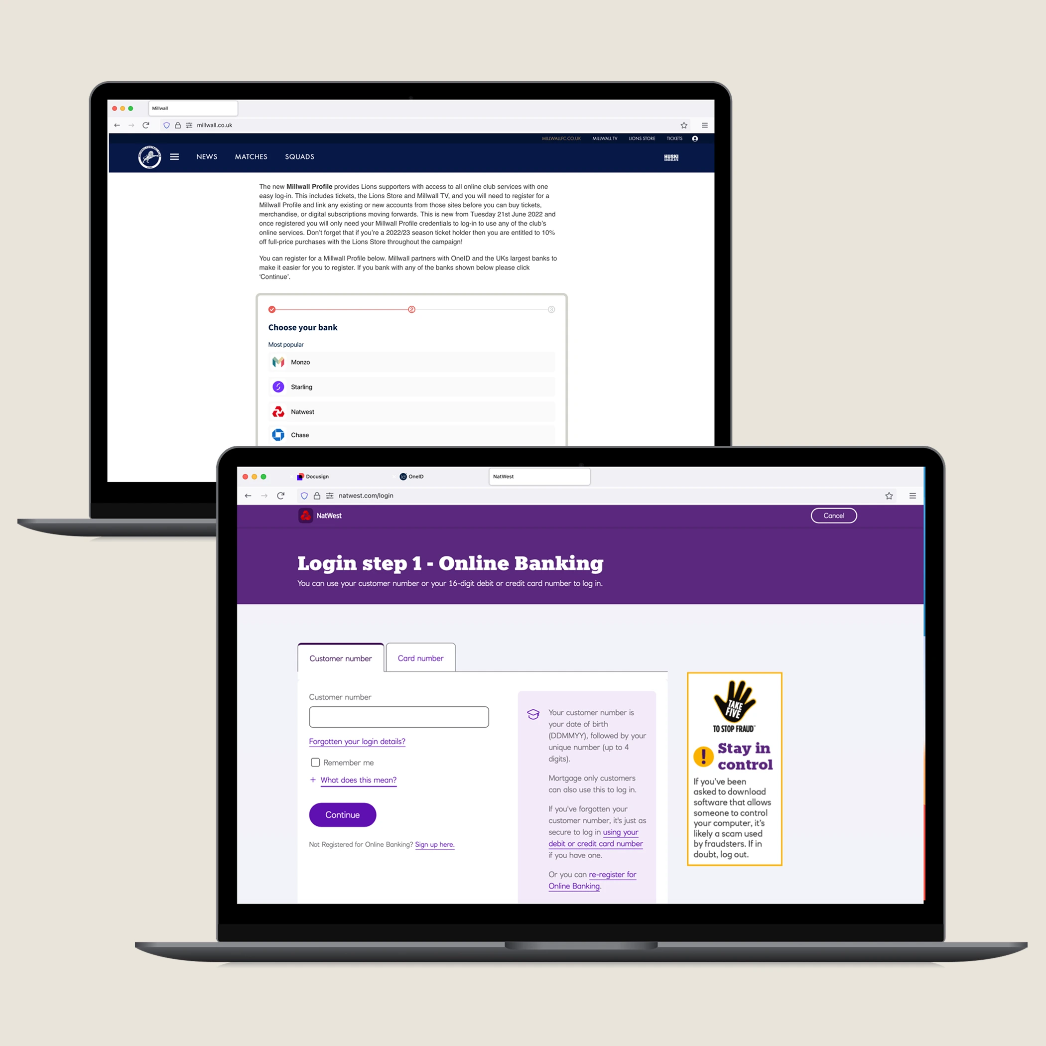
Customers
Needed flexibility
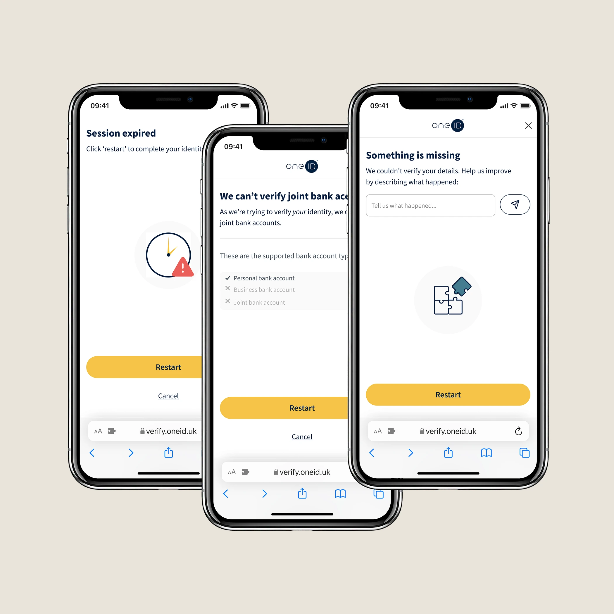
Edge cases — joint accounts, non-UK users, long age checks — were actually blocking real adoption.
OneID
Needed a product that could grow
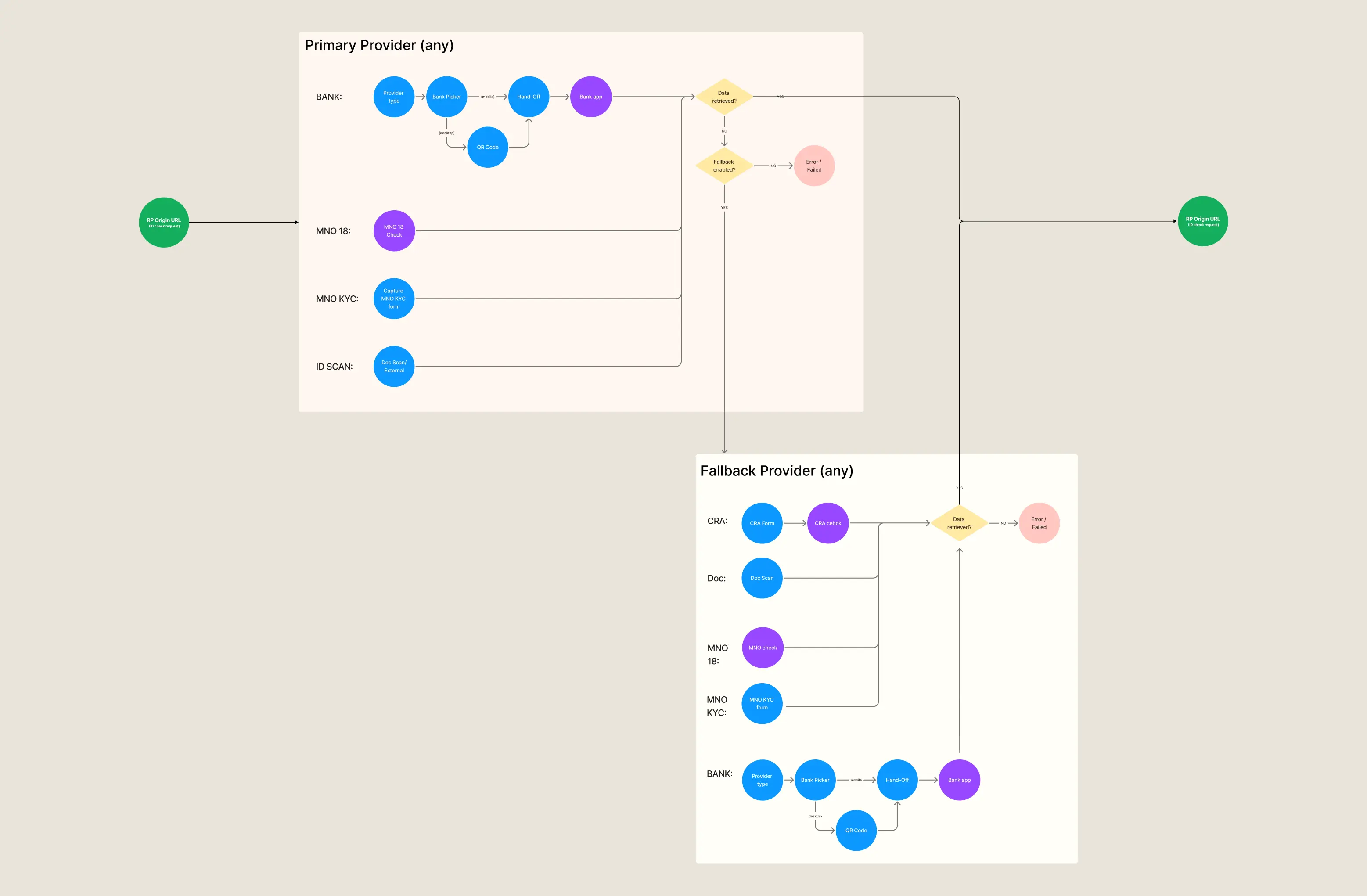
The first-time experience was strong, but the cost model didn't scale and the architecture made it hard to move fast.
User testing insight
The challenge wasn't just UX. It was understanding where these tensions overlapped and designing a product that could hold all three — without pretending the trade-offs didn't exist.
Framing
the
approach

The research made one thing clear: we couldn't fix everything at once without breaking what was already working. Completion rates were suffering at specific, identifiable points — not everywhere. So we split the work into three phases, each one building on the last.

1
Stabilise and improve
Fix the existing bank-based journey — address drop-off at specific points now.
2
Expand coverage
Address the edge cases blocking customers from committing — joint accounts, international users, e-commerce.
3
Redesign the economics
Make the product sustainable at scale — reuse, cost per check, and user accounts.

This wasn't just a sensible project plan. It was a way of protecting the team: giving engineering fast wins without betting on architectural decisions we hadn't validated yet.

Optimising
what
exists

These changes focused on reducing cognitive load at the most sensitive points of the journey — particularly where users were asked to connect their bank.

Before
OneID was embedded directly inside customers' websites — at the mercy of their layouts, responsiveness, and accessibility decisions. A product asking people to do something sensitive was behaving like a widget.
After
Moving into a modal or new tab gave us back control — a consistent, accessible experience regardless of where OneID was deployed. It also unlocked new distribution channels: email links, QR codes for in-person scenarios like age checks at self-service kiosks.
Embedded — before Controlled environment — after
Before
The original first screen read like an onboarding guide. Dense copy, multiple explanations, a lot of words before any action. In an identity flow — where users are already on edge — it felt like something to be wary of.
After
We stripped it back. One clear message: what's being verified, and why it's safe. No more than the user needed to take the next step with confidence.
Before
Desktop users were dropping off at a rate 21% higher than mobile. Getting to your bank on a laptop means navigating to a website, entering credentials, waiting for two-factor. Effortful enough to break the moment.
After
A QR code letting users hand off to their phone, where their bank app is already installed and a face scan is all it takes. A small shift in interaction model with a meaningful impact on completion.
Bank findability — before QR handoff — after
Before
When something went wrong, OneID showed one message: "Something went wrong." No context, no next step. Errors in identity verification don't just create friction — they create doubt.
After
I mapped every recognisable error state, wrote plain-language explanations, and built recovery paths — letting someone retry with a different bank if their first choice wasn't supported. Turning dead ends into decision points.
Error states — before Recovery paths — after
A new
design
system

The design system built during this project became its own case study — explore how it was built →

Expanding
coverage

The first phase delivered real gains (~+27% completion). But it exposed something we'd been working around: bank verification alone couldn't serve everyone.

Users without digital bank accounts. Joint account holders. People outside the UK. E-commerce scenarios where speed was everything. These were whole groups of customers we couldn't reach.

We began adding alternative verification methods — document scanning first, then a growing set of identity providers for different regulatory contexts.

Linear fallback — document scanning
As we added options, new tensions emerged. Employment pre-screening needed both document scans and bank verification. Age verification didn't want a fallback — it wanted user choice. We weren't just expanding coverage anymore. We were being asked to compose verification flows from multiple parts.
Orchestration
& system
thinking

This was the moment that changed how I thought about the product.

Until now, OneID sold named products — ID Check, ID Assure, Age Check, Age Assure — each a fixed solution for a specific use case. Customers had needs that didn't map cleanly to any single product. New use cases kept arriving. Every addition created another thing to maintain, position, and explain.

We made a deliberate decision to stop selling products and start selling one thing: customer verification. A single solution that customers could configure based on what they actually needed.

Under the hood, this meant restructuring OneID around an orchestration layer. Verification methods became modular components that could be combined per context. From a customer's perspective: instead of choosing between products, they were shaping one.

Orchestration introduced real backend complexity and significant upfront engineering. But it was the only model that could scale — no fixed product catalogue would ever keep pace with how compliance requirements actually evolve.

Orchestration layer diagram
Cost,
reuse &
economics

By this point, OneID was processing around 800,000 verifications a week — 300× the volume when I joined. At that scale, even small inefficiencies compound fast.

The cost model had a structural problem: every verification had a per-check cost, including for returning users. Someone signing documents in DocuSign three times a month was being verified from scratch each time. Meanwhile, competitors with app-based models were building loyalty out of reuse.

Reuse couldn't be just a UX improvement. It required a genuine shift in what OneID was willing to hold on behalf of its users — and how it protected that responsibility.

We introduced OneID Accounts: a way for users to save their verified results and unlock them again with a passkey, with end-to-end encryption ensuring only they could access their data. The result was a 2/3 reduction in cost per check for returning users.

Open cost analysis →
Check
user
journey

Live clickable prototype coming soon.

Measurable
outcomes
+47%
Increase in success rate
+15%
User adoption for key client
−91s
Time to complete for returning users
My
OneID.

Reuse was the first step in building a relationship to maintain. But it surfaced a gap: users had no visibility into their own verified identity. They couldn't see which organisations had checked them, manage their data, or delete their account without contacting OneID directly.

I'm currently designing MyOneID — a user-facing portal that gives people genuine control over their identity data. Not just GDPR compliance as a backend function, but transparency as a product feature.

If orchestration made OneID more powerful for businesses, MyOneID is what makes it trustworthy for the people at the centre of it. Identity verification, done right, shouldn't feel like something that happens to you. It should feel like something you're in control of.

MyOneID screens
Get in touch
a.galvao@outlook.com
Next project
Design System →